

Most AI text work is a round trip. Copy leaves the page, gets rewritten somewhere else, and comes back to be re-fitted.
Every judgment in the middle of that loop happens in a blank window. No measure, no leading, no rag. Just words on white.
That’s the part that costs a professional. The consequence of a text edit is a typographic consequence, and it only shows up where the type is set.
Contrary to popular belief, two characters over in a headline slot isn’t a writing problem. It’s a fit problem that happens to be solved with words.
We built Quarky AI assistant to fix the type-layout challenge.
Quarky is built into QuarkXPress, generating, refining, and translating text inside the layout rather than beside it. The text services sit in the Quick Access Bar, next to the box you are currently working in, so in-layout text editing happens in the same environment as the typography and production decisions it affects.
Here are seven ways Quarky AI assistant can support your design, without you leaving your layout.
Way #1: Fill a Layout With Real Copy Instead of Lorem Ipsum
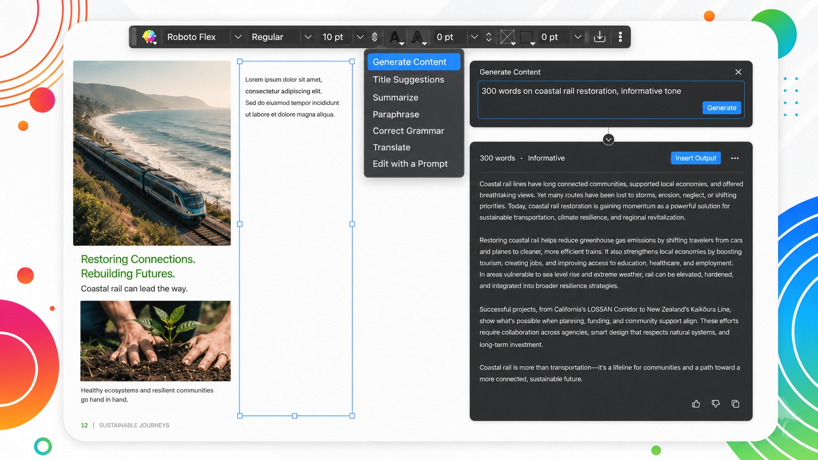
The grid is built. The images are placed. The approved copy does not exist yet.
So the first typographic decisions of the job get made against Latin. Measure, leading and heading weight, all judged on text that behaves nothing like the finished thing. Wrong word lengths, wrong rhythm, and none of the long compounds or proper nouns that will eventually break the lines.
Content Generation writes into the selected box, to a subject and a length you describe. The controls sit in the Quick Access Bar, changing with whatever is currently selected, so an active text box puts the text services in front of you and nothing else.
Placeholder copy that behaves like real copy makes an unfinished spread judgeable. The decisions about measure and hierarchy get made against reality instead of against Latin, which is why they still hold when the real text comes in.
Professional designers know a spread cannot be judged on copy that sets nothing like the real thing.
Way #2: Generate Headline Options That Fit the Space You Have
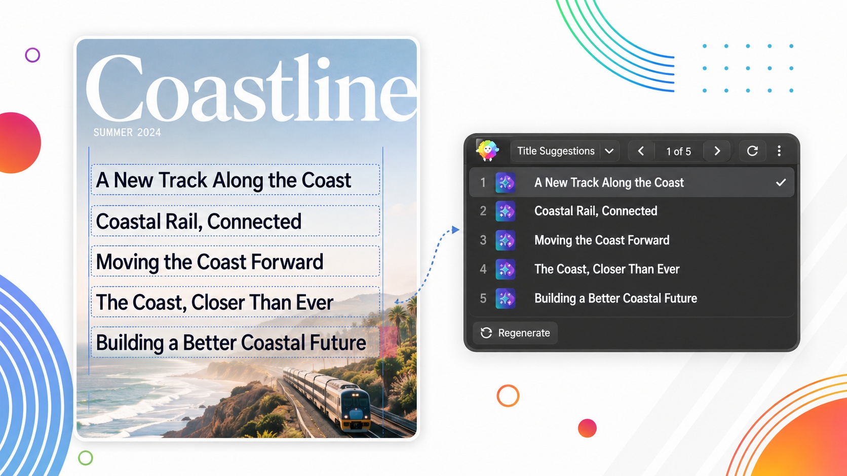
A headline slot has a width. The candidate everybody in the room likes runs two characters over it.
The usual fix is to write the same idea again. Then again, in a slightly different order, until a version lands inside the measure at the size that fits the designed layout.
That loop is not writing. It’s guessing at length.
Title Suggestions returns five options for the selected content by default. The arrows browse them, and Regenerate brings a fresh set.
Choosing between parallel phrasings of one idea is an entirely different task from reinventing options one at a time.
The length differences also stop being estimates. Every option can be set into the real slot at the real size, so the decision gets made against the measure rather than against a character count held in your head.
Choosing beats inventing, and against a fixed measure it’s more accurate too.
Way #3: Cut Copy To Fit Without Losing the Point
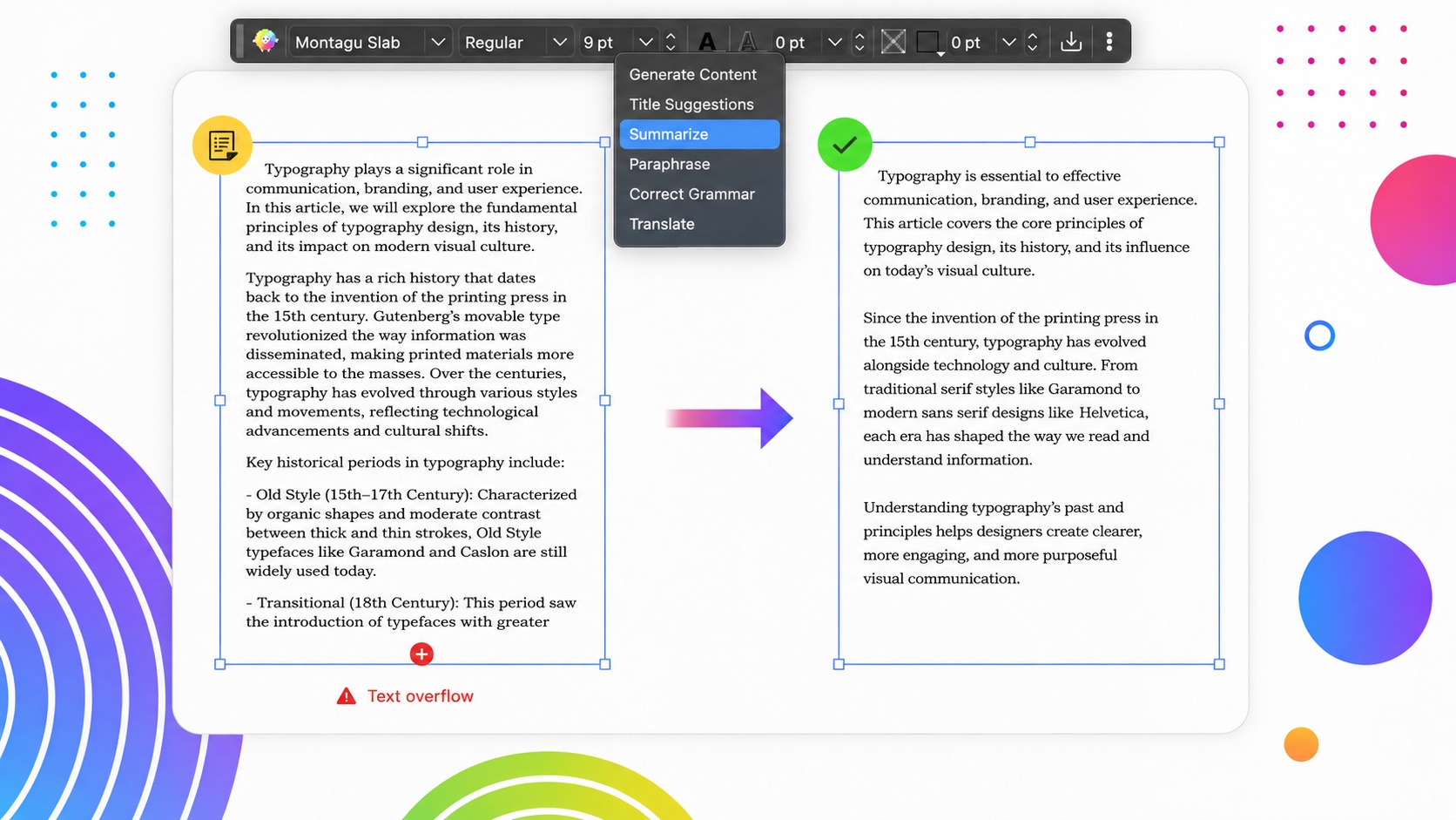
Overflow in a frame that can grow is an inconvenience. Overflow in a frame that cannot is the job.
A fixed page count. An ad boundary sold months ago. A plate already booked. The box can come with hard limits.
The temptation at that point is to make the type absorb the problem. A point down, tracking pulled in, leading tightened until the last line clears. Each one is a small loss. Stacked across a document, they read as one large one.
Summarize condenses the selected text so the shorter version still carries the message. The reduction lands on the words – where the surplus sits – so the type spec written at the start of the job survives the fix.
The copy ends inside the box, with the leading and tracking exactly where you set them.
Professionals protect the type spec by shortening the copy, not the other way round.
Way #4: Rewrite a Paragraph for a Cleaner Rag
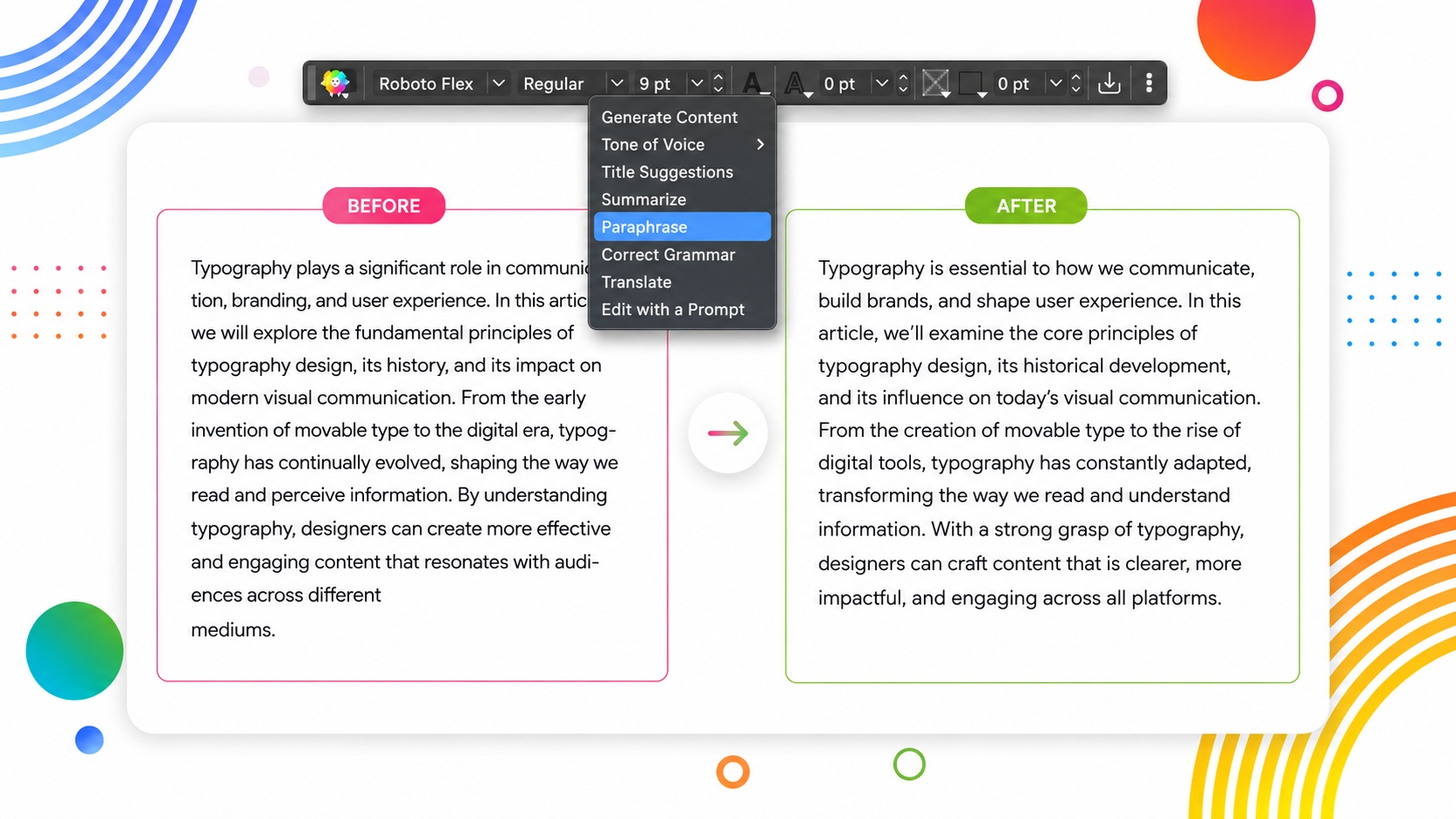
Some paragraphs fit and still set badly. The measure is right, the leading is right, and the right-hand edge saws in and out. A single word sits alone on the last line. Three hyphens stack up down the edge of the column.
Length is not the problem. The breaks are.
Paraphrase rewords the selected text for clarity or visual balance, with the meaning held. Words of comparable length break in different places, so once the type is already correct, changing the words is the lever left.
That makes it a typographic control rather than a copy edit. You’re not adjusting the writing. You’re moving where the lines end, which is what an hour of hand-editing that paragraph would have been doing anyway, one line at a time.
A rag is set with words as much as with settings.
Way #5: Proof the Text Where It Sits
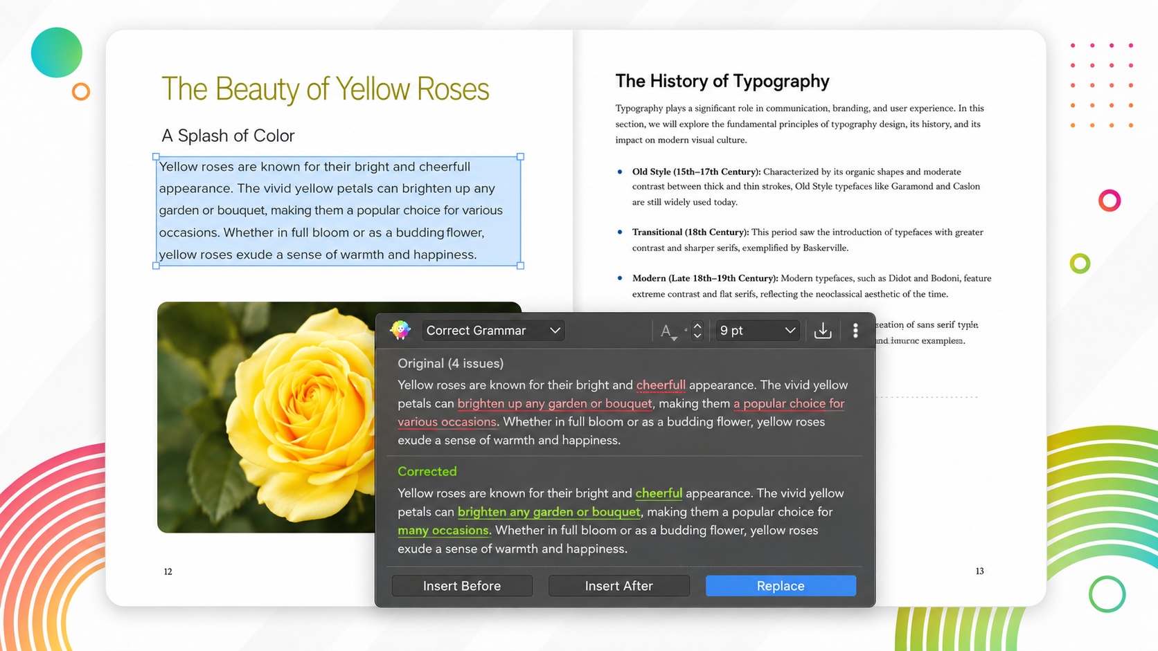
Late in a job, the risk moves. The error stops being the danger as much as the fix, because any correction on a fitted page threatens the reflow the whole spread depends on.
Correct Grammar handles spelling, grammar, and punctuation on the selected text, with the meaning untouched. The result comes back as Insert Before, Insert After or Replace.
Because the correction happens in position, the reflow is visible in the same second it’s caused. A comma that pushes a line. A corrected compound that costs a hyphenation break. A fixed plural that turns two lines into three.
You see it, and you deal with it, on the page, while you still have the page.
That’s the thing a round trip cannot offer. Corrections marked up in another file arrive as a batch, and the refitting pass then happens after the copy comes home, on pages that were signed off as final.
Professional designers know a late correction is a layout event, and it’s cheapest to handle where it lands.
Way #6: Build Language Editions From the Same Layout
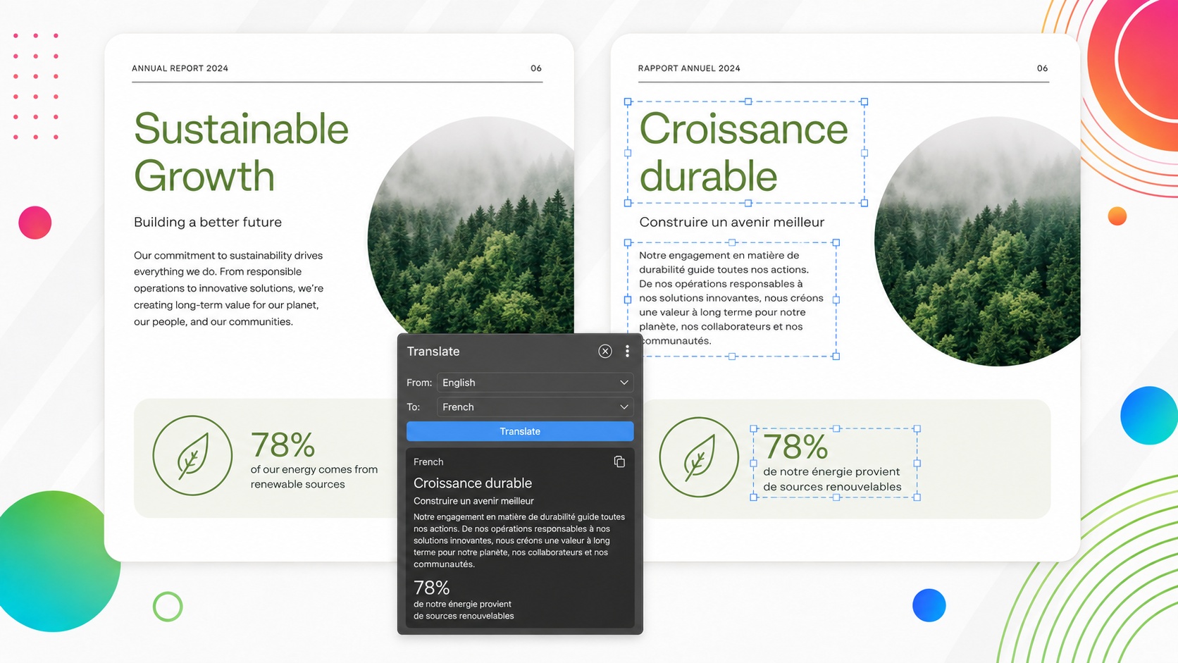
An annual report due in a second language is a fitting problem as much as a translation problem.
Translated copy rarely sets to the same length as the original. A heading tuned to the millimeter runs over. A caption that filled its space leaves a gap under the picture.
Translate converts the selected text into another language with the meaning and context preserved. It arrives inside the frame that has to hold it, which turns expansion from a surprise into the ordinary fitting problem it always was.
It also arrives where the rest of the text services already are. A heading three characters too long gets rephrased. A caption that overruns gets condensed. A paragraph that sets badly in the new language gets reworded. Same controls, same file, same layout you already built and approved.
That’s a second edition built on the layout you have, rather than a layout rebuilt around foreign copy.
Second editions get cheaper when the translation lands in the frame that has to hold it.
Way #7: Change How the Copy Reads, by Preset or in Your Own Words
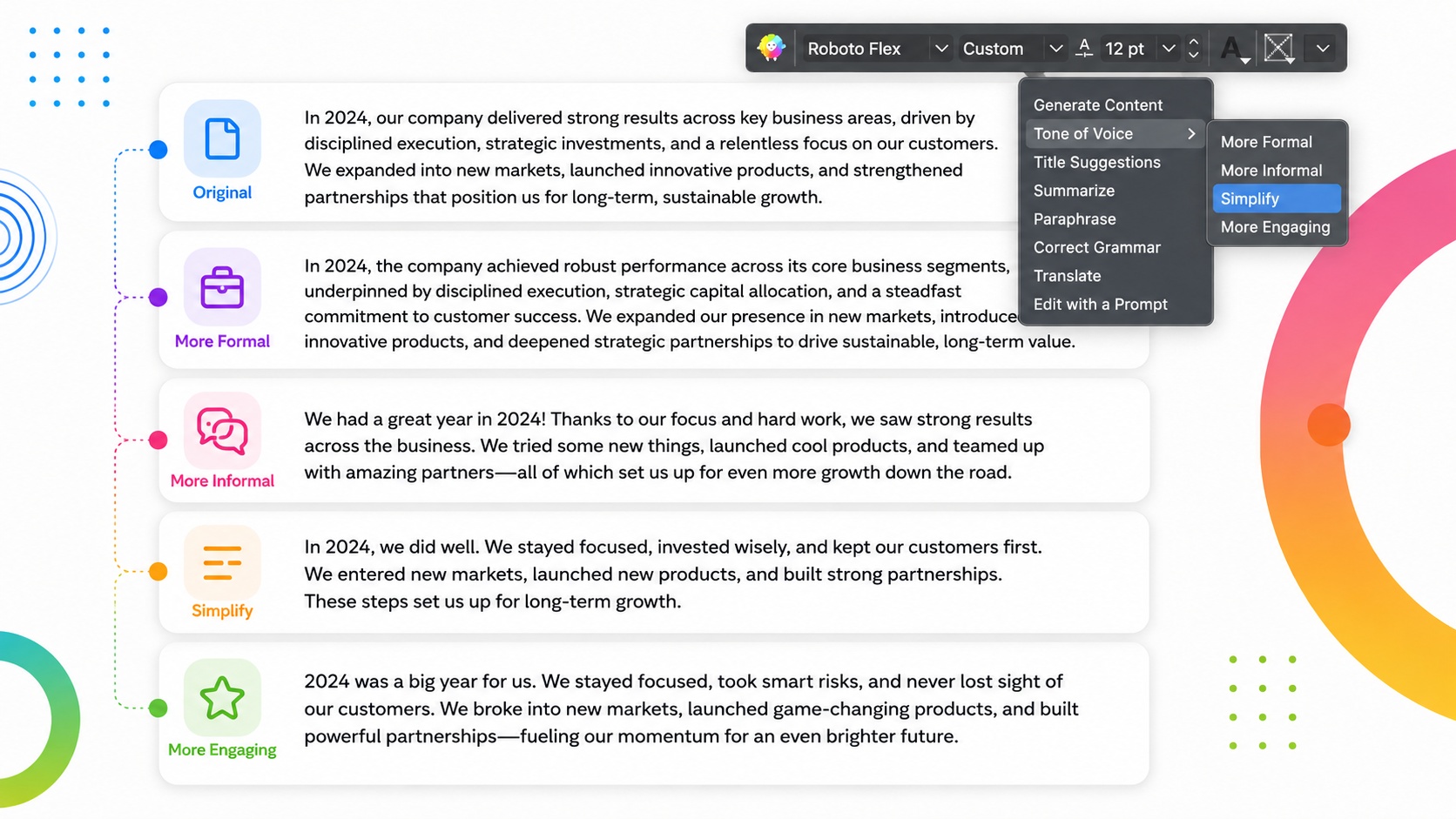
Copy can be correct, fitted and proofed, and still be wrong for the publication.
A feature spread reads like a compliance note. One contributor’s section sits a register away from everything around it. Nothing is broken, and it doesn’t sound like the same magazine.
Tone of Voice adjusts how the text reads through four presets: More Formal, More Informal, Simplify, and More Engaging. Where none of them describes what you are after, Edit with a Prompt takes a typed instruction instead.
Both work the same way. You state the target and read the result in place, which keeps the judgment about what a publication should sound like with the person who knows what it should sound like.
The rewriting is mechanical. The call is not.
Across a hundred pages, that’s the difference between one voice and a manual pass over every section by hand.
One voice across a long document is a judgment call, and it’s easier to make when you can see the result set.
Where the Quarky AI Assistant Fits Into Your Process
Every job here was created by the layout. Not one of them arrived as a writing problem. The frame set the constraint, so the frame is where the constraint gets resolved, and that’s the whole argument for keeping the text work inside the file.
The commercial side is short. For annual subscription customers, and for perpetual license holders with an active Maintenance and Support Plan on QuarkXPress 2026, it’s included at no extra cost. The entitlement runs to 7,200 Quarky AI pages a year, and student, government and nonprofit plans carry the same. At that volume the question stops being whether to spend on it and becomes which parts of a production process it belongs in.
The controls are just as plain. Preferences > AI Management holds a master Enable Generative AI Features checkbox, independent toggles for Quarky and for AI-Powered Font Pairing, which draws on its own allowance of 5,000 instances, and an AI Usage button showing what’s left. Submitted text is processed to produce the result you asked for and never used to train AI models, and Quarky reads only what you send it rather than the rest of the project.
So the useful question is not which of these to adopt wholesale. It’s which of these moments in your own files you would hand over, and which you would rather keep in your hands.
Taking two and leaving five is a real decision, and for plenty of working designers it’s the right call to make. AI is here to cut friction, and where it falls depends entirely on the pressure points in your workflow.
The mechanical part of the work is what moves. The part that decides what the page does, and what it sounds like, stays where it should.
Start a 7-day free trial, or get fully set up today.
FAQ
How do I get better placeholder copy?
Detail governs usefulness in this use case.
A prompt of “cats” will return generic copy that still won’t help you build your layout. Exercising professional judgment by naming the subject, target length, and tone will get you closer to copy you can actually build around.
How do I get a headline to fit without shrinking the type?
Work on the words before you work on the type.
Title Suggestions gives you five alternative versions of the selected content by default. Test those options in the real headline slot at the real point size, and use Regenerate if none of them land cleanly.
That keeps the decision tied to the measure instead of solving a copy problem by compromising the type spec.
What should I do when copy overflows a fixed text frame?
Shorten the copy before squeezing the typography.
Summarize condenses the selected text while keeping its message, which lets you remove the surplus from the words instead of dropping the point size, tightening the tracking or reducing the leading.
The goal is to make the copy fit the designed box without making the design absorb the problem.
How can I improve a bad rag without changing my type settings?
Change where the words break.
If the measure, point size and leading are already right, Paraphrase can reword the selected text while holding its meaning. Different word lengths create different line endings, which gives you another way to deal with an uneven rag, a widow or stacked hyphens.
You still judge the result on the page. Quarky changes the wording. You decide whether the type sets better.
Why proof copy inside the layout?
Because a correction can create a new layout problem.
Correct Grammar works on selected text and returns the correction where the copy is already set. That means you immediately see whether a changed word, comma or compound pushes a line, changes a hyphenation break or causes new reflow.
A late correction is safest when you can see its typographic consequence at the same time.
What should I do when translated copy no longer fits the original layout?
Treat it as a fitting problem.
Translate puts the new language into the frame that has to hold it. If a heading then runs long, you can rephrase it. If a caption overruns, you can condense it. If a paragraph sets badly, you can reword it.
The layout stays your reference point instead of becoming something you rebuild after the translation comes back.
Do I need to use every Quarky AI feature in my workflow?
No.
The useful question is which parts of your production process create enough mechanical friction to hand over. You might use Quarky for headline options and late proof corrections while leaving everything else alone.
Taking two uses and leaving five is still a perfectly legitimate workflow. The judgment about what the page does and what it sounds like stays with the designer.
