
Quark XML Author Structure Element Definition
Each element that makes up the element definition section of the schema is defined below. An example is provided with each to demonstrate proper syntax for the element’s use.
The Elements element contains the collection of element definition elements for the schema, and is a direct child of the XpressSchema root element. Elements uses no attributes.
<Elements>
  <ElementDef name="title">
    <!-- Element definition data -->
  </ElementDef>
  <!-- Additional ElementDef elements here -->
</Elements>
ElementDef
ElementDef defines a single element of the schema. ElementDef names the element and provides basic information about it. Child nodes, discussed later in this section, further define the element.

Figure 14‑1: Configuration-XSD ElementDef definition
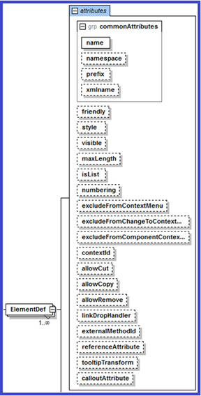
Figure 14‑2: Configuration-XSD ElementDef definition with attributes
ElementDef may use any of the attributes defined in the Common Attributes attribute group. It has several additional optional attributes available, each of which is defined below.
Table 14‑1: ElementDef Attributes
|
Attribute |
Required |
Definition |
|
allowCopy |
no |
Boolean. Defaults to true. If set to false, the Copy context menu item for the element is disabled. |
|
allowCut |
no |
Boolean. Defaults to true. If set to false, the Cut context menu item for the element is disabled. |
|
allowRemove |
no |
Boolean. Defaults to true. If set to false, the Remove context menu item for the element is disabled. |
|
calloutAttribute |
no |
Used with any numbered style ElementDef. When the document is saved/exported, the calloutAttribute attribute value will contain the list string value of the numbered style element. |
|
contextId |
no |
Specifies a contextual identifier for the element. If a SectionType within the ElementDef also has a contextId, the SectionType contextId overrides the ElementDef contextId. |
|
excludeFromChangeToContextMenu |
no |
Boolean. Set to true to remove the Change To menu from this element's context menu and exclude this element from the Change To context menu of other element types. The Change To feature would be unavailable from the user interface. Defaults to false. |
|
excludeFromComponentContextMenu |
no |
Boolean. Defaults to false. Set to true to exclude the component from the component context menu. |
|
excludeFromContextMenu |
no |
Boolean. Set to true if the ElementDef defines an element that the user cannot insert directly into the document. This applies to internally generated insertable items, not to items added via externalMethodID. |
|
excludeExternalFriendlyFromContextMenu |
no |
Boolean. Set to true if the ElementDef defines an element that the user cannot insert directly into the document. This applies to items added via externalMethodID. |
|
externalMethodId |
no |
The externalMethodId attribute on an ElementDef node lets an EI developer control the actual fragment that gets inserted in Quark XML Author. This is different from the EIs defined under the <ExtensibilityMethods> node which let you perform operations on an existing fragment. If used, this attribute adds an insertable item to the Context Menu. Be sure to set excludeFromContextMenu to true, so that the internally generated insertable item is hidden. The EI method that is called must return an XmlElement. If it returns null or a non-Xml Element the insert will be cancelled as if the user cancelled the Insert operation. If the EI throws an exception, an error dialog will be shown in Quark XML Author notifying the user about Insert failure. The returned XmlElement must match the name of the insertable element which the user selected and must match the structure defined for the element in the XAS. If it does not match, the user will be shown en error dialog and Insert will be cancelled. Note that the method called can use the Tag argument type to pass the actual caption name that the user clicks in Quark XML Author. See Tag in section 6.2.1.2 for more information about the Tag argument. This provides a way of providing the caption to the EI, but the EI may not modify the caption. See the case study presented in Chapter 21 for examples of using externalMethodId in this context. This attribute can only be specified for an optional element in the schema. |
|
externalMethodFriendly |
no |
Specifies the friendly name associated with the external method that will be displayed in the user interface, Content Menu. <ElementDef name="section1" friendly="Section 1" xmlname="topic" visible="false" referenceAttribute="conref" externalMethodId="GetElement" externalMethodFriendly="Section 1 from server"> If externalMethodId is specified and externalMethodFriendly is omitted, the label displayed to the user in the insertables Context Menu and Styles control is @friendly or @name with “(custom)” appended. |
|
Friendly |
no |
Specifies a friendly name for the element being defined. |
|
isList |
no |
Boolean. Defaults to false. If set to true, this element will be regarded as a list item by the list manager. If set to false, the list manager will ignore this node.
isList specifies whether or not a numbered list may continue numbering from a previous sibling numbered list. If a configuration contains the following hierarchy:
Section List List Item
Then a Quark XML Author document may contain the following content:
Section A List A List Item 1 List Item 2 Section B List B List Item 1 List Item 2
In the configuration, if isList is set to true for Section, then the numbering of List B may continue from List A. List B > List Item 1 may be numbered 3. In the configuration, if isList is set to false for Section and true for List, List B may not continue from List A. List B > List Item 1 may only be numbered 1. |
|
isTable |
no |
Deprecated in 4.x tables. For pre 4.0 tables, set to true if the ElementDef defines a table element. Defaults to false. See "Table" for more information about creating tables. |
|
linkDropHandler |
no |
Specifies the ID of the EI method to be called when the user drops a hyperlink onto the element. See “Drag and Drop”. Overrides any other internal XML Author behavior. |
|
maxLength |
no |
Specifies the maximum amount of visible characters that can be added to the element and its descendant elements. The amount is a cumulative total, not the amount allowed in each element. |
|
numbering |
no |
Valid values are: continue and restart. If set to continue, numbering will continue from previous numbered element, ignoring internal logic for numbering continuance or restart. Defaults to restart. |
|
referenceAttribute |
no |
Used when an element can be the target of a cross reference or, in DITA, a conref. The value holds the name of the attribute whose value is required for the resolution of the element. In DITA's case that attribute will be conref. |
|
style |
no |
Specifies the name of a Word style that will be used to render the element in the authoring environment. |
|
tooltipTransform |
no |
Defines the path to an XSLT file used to define the text displayed when the user hovers over the element. |
|
visible |
no |
Boolean. Set to false if the element will not be visible to the user within the authoring environment. Defaults to false. |
|
allowPortionmark |
No |
Boolean. If set to true, sets the visibility of Portionmarks for an element type. Defaults to False |
Section
Section represents a collection of multiple elements that form a coherent subset of the document, such as a chapter in a book or a subtopic in an article. Section may contain a Para element and/or one or more Sequence or Choice elements, which in turn contain the document elements that comprise the document section.
-
See Para for more information.
-
See Sequence for more information.
-
See Choice for more information.
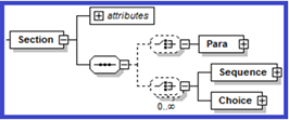
Figure 14‑3: Configuration-XSD ElementDef > Section definition
Table 14‑2: Section Attributes
|
Attribute |
Required |
Definition |
|
displayAttribute |
no |
String. Allows you to specify that instead of the element name, the value of the attribute named will be displayed to the user. |
|
displayElement |
no |
Boolean. If set to true, the display name of the element’s Component menu will be the name of the element's first child element. This attribute is used to facilitate the following use case. The element C has two child elements, A and B. This attribute allows the user to right-click on A or B and access the Component menu for C, which is the “insertable” parent of A and B. |
Para
Para represents a text element, such as a paragraph, caption, or title. It may have an Emphasis child element to indicate that emphasis styles may be applied to the text it contains. Para uses these optional attributes: default, readonly, childTextNode and defaultHyperlink.
Table 14‑3: Para Attributes
|
Attribute |
Required |
Definition |
|
childTextnode |
no |
Set to true to allow combining multiple child text nodes specified under the para node into the parent node. Does not support the insertion of soft line breaks. Pressing Shift-Enter key acts the same as pressing Enter key. Can be used in conjunction with insertAfter. See “Table 14‑133: SectionType Attributes” for more information. |
|
default |
no |
Default text for the para element. |
|
defaultHyperlink |
No |
Specifies the target hyperlink emphasis that should be applied when a text type link is dragged onto this para type element. If defaultHyperlink is not specified, text links are ignored. For a given dropped link on a para type element, precedence is resolution of an inline element resolution and then evaluation for hyperlink emphasis. Formats are categorized as definitions with and without SubStyles defined: Without SubStyles defined: {emphasisName} Specify the name of an existing emphasis definition. This format is used when the target emphasis definition has Style defined, but no SubStyles defined. With SubStyles defined: {emphasisName}@{attributeName}={attributeValue}. For example, defaultHyperlink=”xrefemph@format='html'” or defaultHyperlink="xrefemph@outputclass='inter'" The string following the @ identifies which sub-style to apply on the canvas. For example, <EmphasisDef name="xrefemph" friendly="Cross Reference" xmlname="xref" excludeFromEmphasisCombo="true">
or
|
|
readonly |
no |
Set to true to lock the para element upon insertion so that the user cannot edit the default text. |
Qua childTextnode Serialization
This section discusses the serialization of childTextnodes elements. Given the following sample configuration fragment.
<ElementDef name="p">
            <Section>
                        <Para/>
                        <Choice minOccurs="0" maxOccurs="unbounded">
                                    <SectionType name="..."/>
                                    <SectionType name="my-child-textnode"/>
                        </Choice>
            </Section>
</ElementDef>
When a user inserts my-child-textnode, an element is added to the XOM just like any other element. However, the element is temporary and exists only while the document is open in Quark XML Author. The childTextnode element only exists to hold a text fragment for its parent para-type (<p>). When serialized, the childTextnodes wrapper is dropped, leaving its text fragment within the parent element.
For example, the following XOM:
<p>first text fragment
   <my-child-textnode>second text fragment</my-child-textnode>
   <my-child-textnode>third text fragment</my-child-textnode>
</p>
is serialized as:
<p>first text fragment
second text fragment
third text fragment
</p>
Let’s look at a mixed-content example.
The following content on the canvas inside a cell (an element named “entry”):
--------(Empty)
<CellChildTextNode> first child text node</CellChildTextNode>
--------(Empty)
-
One
--------(Empty)
-
Two
--------(Empty)
<CellChildTextNode> second child text node</CellChildTextNode>
------ (Empty)
<CellChildTextNode> third child text node</CellChildTextNode>
is serialized as:
<entry> first child text node <bulletul><bulletuli>one</bulletuli><bulletuli>two</bulletuli></bulletul> second child text node\n third child text node</entry>
During Serialization, adjacent childTextnode elements are serialized as a single textnode fragment, with each element delimited in XML with a line break.
Deserialization inserts a childTextnode element for each line break for each textnode fragment. When the document is re-opened, the content is displayed on the canvas the same as it did before the document was closed.
childTextnode
The following discusses the user experience and developer’s perspective.
From a user’s perspective, right-clicking a childTextnode provides access to Attributes and EI methods associated with the childTextnode’s parent element.
From an EI developer’s perspective, with the current selection on a child textnode, the XomCurrentNode argument references an element in the XOM associated with the childTextnode, distinct from its parent element.
For more information see, “Error! Reference source not found.”
Emphasis is not ‘inherited’ from the parent. The emphasis defined for the child text node must match the parent. Multiple parent elements could contain the childtextnode Child so this is important.
Emphasis
Emphasis represents an inline element. The Para element has an optional child element named Emphasis. The Emphasis element contains an EmphasisType child node for each emphasis style that can be applied to the text in a Para element.
Table 14‑4: Emphasis Attributes
|
Attribute |
Required |
Definition |
|
allowMedia |
no |
Specifies whether media is allowed under Emphasis. If set to yes, allows media elements under any emphasis. If set to no, does not allow media under any emphasis. If set to restricted, the allow/disallow behavior is derived from the individual emphasis definitions under the EmphasisDef/Media node. |
|
allowOLE |
no |
Specifies whether OLE elements are allowed under Emphasis. If set to yes, allows OLE elements under any emphasis. If set to no, does not allow OLE elements under any emphasis. If set to restricted, the allow/disallow behavior is derived from the individual emphasis definitions under the EmphasisDef/OLE node. |
Table 14‑5: EmphasisType Attributes
|
Attribute |
Required |
Definition |
|
name |
yes |
Identifies an EmphasisDef node in the schema. |
Inline Media
The Para element has an optional child element named Media. This element contains a MediaType child node for each media type that can be inserted inline to the text in a Para element.
Table 14‑6: MediaType Attributes
|
Attribute |
Required |
Definition |
|
name |
yes |
Identifies an ElementDef node in the schema. |
See “Images” for a list of supported image formats.
Inline OLE
The Para element has an optional child element named OLE. This element contains a OLEType child node for each OLE type that can be inserted inline to the text in a Para element.
Supported element types include:
-
MathTypeEquation
Table 14‑7: OLEType Attributes
|
Attribute |
Required |
Definition |
|
name |
yes |
The name of the elementDef containing the OLE definition. |
Sequence
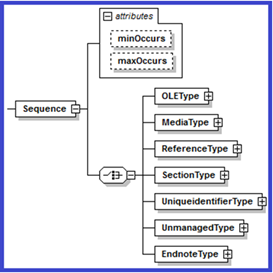
A Sequence element indicates that the elements it contains can only be inserted into a document in the order in which they are listed. Sequence may contain any of the following child elements: OLEType, MediaType, TableType, ReferenceType, SectionType, UniqueidentifierType, UnmanagedType and EndnoteType.
These elements are defined later in this chapter.
-
See “OLEType” for more information.
-
See “TableType” for more information.
See “Table 14‑10: TableType Attributes
|
Attribute |
Required |
Definition |
|
Name |
yes |
Specifies the name by which the element will be identified. |
|
insertAfter |
no |
Allows you to add new body text after a table when the <Enter> key is used at the top or at the end of a table. |
-
See "MediaType” for more information.
-
See “ReferenceType” for more information.
-
See “SectionType” for more information.
-
See “UniqueidentifierType” for more information.
-
See “UnmanagedType” for more information.
-
See “EndNoteType” for more information.
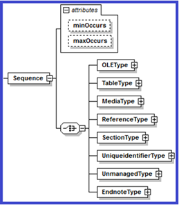
Figure 14‑4: Configuration-XSD Section > Sequence definition
Table 14‑8: Sequence Attributes
Attribute
Required
Definition
maxOccurs
no
Indicates the maximum number of times the element can be added to the section. Valid values are: 1 and UNBOUNDED. The latter indicates that there is no limit to the number of times the element may be added. Defaults to 1.
minOccurs
no
Indicates the minimum number of times the element can be added to the section. Valid values are 0 and 1. Defaults to 1.
Choice
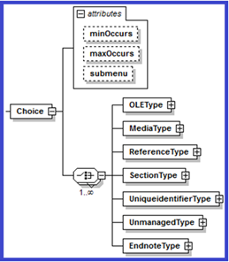
A choice element indicates that the elements it contains can be inserted into a document in any order. Choice may contain any of the following child elements: OLEType, MediaType, TableType, ReferenceType, SectionType, UniqueidentifierType, UnmanagedType and EndnoteType.
These elements are defined later in this chapter.
-
See “OLEType” for more information.
-
See “TableType” for more information.
See “Table 14‑10: TableType Attributes
|
Attribute |
Required |
Definition |
|
Name |
yes |
Specifies the name by which the element will be identified. |
|
insertAfter |
no |
Allows you to add new body text after a table when the <Enter> key is used at the top or at the end of a table. |
-
See "MediaType” for more information.
-
See “ReferenceType” for more information.
-
See “SectionType” for more information.
-
See “UniqueidentifierType” for more information.
-
See “UnmanagedType” for more information.
-
See “EndNoteType” for more information.
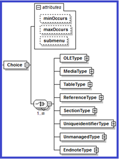
Figure 14‑5: Configuration-XSD Section > Choice definition
The number of required Choice elements that can be specified for a given section is unlimited. Required elements can have required Choice elements and this can cascade to an arbitrary depth. Likewise, required Choice elements can themselves have required Choice elements and this can cascade to an arbitrary depth.
Table 14‑9: Choice Attributes
Attribute
Required
Definition
maxOccurs
no
Indicates the maximum number of times the element can be added to the section. Valid values are: 1 and UNBOUNDED. The latter indicates that there is no limit to the number of times the element may be added. Defaults to 1.
minOccurs
no
Indicates the minimum number of times the element can be added to the section. Valid values are 0 and 1. Defaults to 1.
submenu
no
Boolean. Used only with the Choice element. If set to false, required child elements will appear beneath the element in the context menu, instead of in a submenu. Defaults to true.
OLEType
Indicates that a type of OLE element can be inserted into the Sequence or Choice. It uses only one attribute: name, which is required, and specifies the name by which the element will be identified.
See “OLE” for more information.
TableType
Indicates that a type of Table can be inserted into the Sequence or Choice.
See “Table” for more information.
Example:
<TableType name="CalsTable" insertAfter="p"/>
<TableType name="simpletable" insertAfter="p"/>
<TableType name="HtmlTable" insertAfter="p"/>
Table 14‑10: TableType Attributes
|
Attribute |
Required |
Definition |
|
Name |
yes |
Specifies the name by which the element will be identified. |
|
insertAfter |
no |
Allows you to add new body text after a table when the <Enter> key is used at the top or at the end of a table. |
MediaType
MediaType indicates that a media element can be inserted into the Sequence or Choice within the Section.
See “Media” for more information.
Table 14‑111: MediaType Attributes
|
Attribute |
Required |
Definition |
|
friendly |
no |
Specifies a friendly name for the element. |
|
name |
yes |
Specifies the name by which the element will be identified. |
|
style |
no |
Specifies a Word style name that will be used to render the element's text in the user interface. |
ReferenceType
ReferenceType indicates that a reference element can be inserted into the Sequence or Choice within the Section.
See “Reference” for more information.
Table 14‑122: ReferenceType Attributes
|
Attribute |
Required |
Definition |
|
insertAfter |
no |
Specifies the element to be inserted after the current element if the user hits the Enter key. |
|
insertAfterBlank |
no |
Used with list items only. Specifies the element to be inserted after the parent list element if the user presses the Enter key and the current list item has no text. |
|
friendly |
no |
Specifies a friendly name for the element. This is used to override the friendly specified in the definition. |
|
name |
yes |
Specifies the name by which the element will be identified. |
|
style |
no |
Specifies a Word style name that will be used to render the element's text in the user interface. |
SectionType
SectionType indicates that a Section element can be inserted into the Sequence or Choice within another Section.
See “Section” for more information.
SectionType may use any of the attributes defined within the definitionAttributes attribute group. It also requires the use of the name attribute, which specifies the name by which the element will be identified.
Table 14‑133: SectionType Attributes
|
Attribute |
Required |
Definition |
|
contextId |
no |
Specifies a contextual identifier for the reference. If the parent element has a contextId, the SectionType contextId overrides the parent. |
|
default |
no |
Default text for the element. Note that certain characters (forward slash, left and right square braces, left and right curly braces, star, and tilde) are reserved by the system and must be represented by codes. Codes are given in Table 5‑18 on page 82. |
|
decreaseIndent |
no |
Value indicates a different element to which the present element will be changed when the user presses Shift + Tab at the beginning of the element. |
|
friendly |
no |
Specifies a friendly name for the element being defined. |
|
increaseIndent |
no |
Value indicates a different element to which the present element will be changed when the user presses the Tab key at the beginning of the element |
|
insertAfter |
no |
Specifies the element to be inserted after the current element if the user presses the Enter key. When the user types in an Empty, the system uses the insertAfter setting of the previous element. |
|
insertAfterBlank |
no |
Used with list items only. Specifies the element to be inserted after the parent list element if the user presses the Enter key and the current list item has no text. |
|
name |
yes |
Specifies the name by which the element will be identified. |
|
numbering |
no |
If set to continue, numbering will continue from previous numbered element, ignoring internal logic for numbering continuance or restart. Defaults to restart. Valid values are continue and restart. |
|
readOnly |
no |
Boolean. Set to true to lock the para element upon insertion so that the user cannot edit the default text. |
|
style |
no |
Specifies the name of a Word style that will be used to render the element in the authoring environment. |
|
visible |
no |
Boolean. Set to false if the element will not be visible to the user within the authoring environment. Defaults to true. |
|
allowPortionmark |
No |
Boolean. If set to true, sets the visibility of Portionmarks for a section type. Defaults to false. |
Multiple Increase/Decrease Indent values
The increaseIndent and decreaseIndent attributes can also specify multiple descendant/ancestor values separated by a forward slash (/). Consider the following example:
<ElementDef name="ol">
  <Section>
    <Sequence maxOccurs="unbounded">
      <SectionType name="oli" increaseIndent="suboli/subuli"/>
    </Sequence>
  </Section>
</ElementDef>
With the following XOM structure:
<ol>
  <oli> ordered list item 1
     <subul>
        <subuli>Unordered sub list item</subuli>
     <subul>
   </oli>
   <oli>ordered list item 2 </oli>
</ol>
Tabbing on the last oli element (shown highlighted above) will convert it to a subuli item under the previous oli sibling. The resulting structure will become:
<ol>
  <oli>
    ordered list item 1
    <subul>
      <subuli>Unordered sub list item</subuli>
      <subuli>ordered list item 2 </subuli>
      <subul>
   </oli>
</ol>
This is because in the SectionType for oli, we have specified both suboli and subuli as possible targets. This example assumes, of course, that the ElementDef for oli allows the necessary child elements that themselves contain subuli and suboli children.
If subuli was not specified (i.e. increaseIndent="suboli"), the resulting structure would be:
<ol>
  <oli>
    ordered list item 1
    <subul>
      <subuli>Unordered sub list item</subuli>
      <subul>
        <subol>
          <subuli>ordered list item 2 </subuli>
        </subol>
      </oli>
</ol>
For example, a new subol gets added under subul if allowed by the schema.
UniqueidentifierType
UniqueidentifierType indicates that a Uniqueidentifier element can be inserted into the Sequence or Choice within a Section. It uses only one attribute: name, which is required, and specifies the name by which the element will be identified.See "Uniqueide
UnmanagedType
UnmanagedType indicates that an Unmanaged element can be inserted into the Sequence or Choice within a Section. It uses only one attribute: name, which is required, and specifies the name by which the element will be identified.
See “Unmanaged” for more information.
EndNoteType
Indicates a type of EndNote that can be stored in the Sequence or Choice. The value for minOccurs on the parent Sequence or Choice is always 0 and the value for maxOccurs on the parent is always 1 for the EndnoteType element, so these values do not need to be specified.
See “EndNote” for more information.
Uniqueidentifier
A Uniqueidentifier element auto-assigns a GUID to the element’s text node. As with other ElementDefs, a Uniqueidentifier may be visible or hidden. When a document is opened, all null Uniqueidentifier elements are auto-assigned. Likewise, when a Uniqueidentifier element is inserted, it is auto-assigned.
See “Uniqueidentifier” for more information.
Unmanaged
An Unmanaged element is one that is inserted into the XOM, but is not used or represented to the user by Quark XML Author. It allows elements to be inserted into the document via and for the use of external applications.
See “UnmanagedTypeUniqueidentifierType” for more information.
OLE
An OLE element allows the insertion of OLE objects as a child of a Section > Sequence and Section > Choice.
See “OLEType” for more information.
It has one attribute, readonly, described in Table 14‑14.
Table 14‑144: OLE Attributes
|
Attribute Name |
Required |
Definition |
|
readonly |
no |
If set to true, the OLE object may not be edited. Defaults to false. |
An OLE element may contain a MathTypeEquation or a OLEWordDocument as a child element. MathTypeEquation attributes are described in Table 14‑15. OLEWordDocument attributes are described in Table 23‑1.
Read-only scenarios
In regards to the readonly attribute, MathTypeEquation and OLEWordDocument are treated differently. In XML Author, if the user double-clicks an MathTypeEquation, the system does not launch the equation editor. If the user double-clicks an OLEWordDocument, the system launches a new Word window that contains the embedded document. This allows users to view the entire Word document. The embedded document is also treated this way if the XML Author document is read-only. For more information, see “SetAccessMode”, “Starter Document” and “IsEditableElement”.
In these read-only scenarios, the new Word window that the system launches is the opened in protected mode with a password. This prevents the user from editing the Word document. Using the document protection feature of Word in this way allows XML Author to react to changes made to the read-only status of the parent XML Author document while it is open. If the embedded document is already open in separate Word window, and the status of the parent XML Author document becomes read-only, then changes in the embedded document are not synched
MathTypeEquation
For more information on implementing math equation support, see "MathType Integration".
Table 14‑155: MathTypeEquation Attributes
|
Attribute Name |
Required |
Definition |
|
exportFormat |
no |
Rendition file type. Supported image formats include:WMF and GIF. Defaults to GIF. |
|
saveMTEF |
no |
Deprecated in 4.5.1. XML Author will open documents that contain data in this format and convert the data to OLE Object format. This occurs transparent to the user. The change was required to reliably preserve and render MathType equation dimensions. If set to true, the math equation data is saved as MTEF (lossless), MathML and image formats, otherwise the data is saved as MathML and image formats. Defaults to true. |
|
saveOLEObject |
no |
If set to true, the math equation data is saved as binary OLE object, MathML and image formats, otherwise the data is saved as MathML and image formats. Defaults to true. Must be used instead of saveMTEF to reliably preserve and render MathType equation dimensions. This must be set to true, because Mathtype 6.0 doesn’t have the ability to import MathML.
|
|
includeMathTypeData |
no |
If set to true, annotation data is saved. Defaults to true. |
|
includeTranslator |
no |
If set to true, translator comments are saved. Defaults to true. |
|
translator |
no |
Specifies a .TDL translator file which is used to control the format of exported MathML. Supports MathType and custom translator files. Defaults to “MathML2 (no namespaces).tdl”. Be aware that some translators do not export MathML, but instead act as inputs to other translators. Contact Design Science technical support for details. |
An example is shown below:
<OLE readonly="false">
      <MathTypeEquation exportFormat="GIF" saveOLEObject="true" translator="MathML2 (no namespace).tdl" includeTranslator="true" includeMathTypeData="true"/>
</OLE>
For information on inline OLE see section 13.1.2 and section 14.2.1.5.
OLEWordDocument
Allows the user to embed a fully functional Word document within an XML Author document. The user can edit the document without restrictions, but the intended use of this feature is to support embedded large/complex tables.
For details implementing embedded Word document support, see "OLE Word Document Integration".
Media
There are two types of Media elements available: one which defines a parent reference element to allow a media object from a repository to be referenced in the document, and one which allows image media to be inserted directly into the document.
See “Table 14‑10: TableType Attributes
|
Attribute |
Required |
Definition |
|
Name |
yes |
Specifies the name by which the element will be identified. |
|
insertAfter |
no |
Allows you to add new body text after a table when the <Enter> key is used at the top or at the end of a table. |
MediaType
 An ElementDef cannot have a media element as both a child element and an "Inline Media"
in the same ElementDef.
Media as Local Object
When media are to be inserted as a local object, the Media element is used as the child of an ElementDef element. It is an empty element, and serves only to notify the Quark XML Author add-in that its content is to be Base64 encoded.
Table 14‑166: Local Media Attributes
|
Attribute |
Required |
Definition |
|
maxFileSize |
no |
Specifies the maximum file size in megabytes. Defaults to 0, which indicates no maximum file size. |
Images

In order for images to be rendered properly on the Word canvas, every image element definition in the solution must be configured with following image data-types: imagewidth, imageheight, imagewidthdpi, imageheightdpi. See “Table 11‑4: Field Attributes – datatype values”.
Supported Image Formats
Quark XML Author supports the following image file formats:
BMP, DIB, EMF, EMZ, GIF, JFIF, JPEG, JPG, JPE, PNG, RLE, TIFF, TIF, WMZ, and WMF.
EPS images are not longer supported in Office. For more information from Microsoft see, " Support for EPS images has been turned off in Office".
Image Validation
When the user attempts to insert an image in a document, the system performs a check to ensure that the image data format matches the format associated with the file extension. If the binary signature in the image header is the correct value for that image file type, then the system inserts the image. If not, the system displays the following message to the user. “{0}” is replaced with the file extension:
“Image data does not match the format associated with the file extension: {0}.”
XML Author processes images based on the file type indicated by the file extension. Occasionally, Quark has encountered images where the image data format and the file extension do not match. These bad images could not be processed and occasionally resulted in corrupt XML Author documents. This check was added to prevent that situation.
In order for images to be rendered properly on the Word canvas, the following image metadata must be known: image width, image height, image width dpi, image height dpi. These values are needed in order to needed in order for the system to properly calculate the area or “box” on the Word canvas in which the image is rendered. For this discussion, the values “exist” if the attributes are present for the XML image element. Before an image is rendered these values are analyzed.
If the image height and width exist and the image height dpi and image width dpi exist and match the values in the image binary data, then the system has all necessary information to calculate the area and render the image.
However, it is possible that some of these values may be missing in the image element or different from the values in the image binary data. In this situation, the following logic applies.
If either image width or image height does exist, then retrieve image width, image height, image width dpi and image height dpi from the image binary data and store them in the image element.
If image width and image height exist, but either image width dpi or image height dpi does not exist, then retrieve image width dpi and image height dpi from the image binary data and store them in the image element.
If image width, image height, image width dpi and image height dpi exist, but either image width dpi or image height dpi is different from the same value in the image binary data, then retrieve image width dpi and image height dpi from the image binary data and use those dpi values to recalculate the image height and width and store these values in the image element.
Reference
Reference defines an element that is used to insert external content into a document, such as a media item or reusable text. It contains one or more ComponentType child elements, or one Media child element, and has no attributes.
Table 14‑177: Reference Attributes
|
Attribute |
Required |
Definition |
|
altAttribute |
|
Specifies any attribute whose value will act as a tooltip for a referenced image. |
See “ReferenceType” for more information.
<ElementDef name="media" friendly="Media Reference" style="Reference">
  <Reference>
    <Media xmlname="mediaobjectDef" friendly="Media">
      <Mimetypes>
        <!-- Mimetype elements -->
      </Mimetypes>
      <Attributes>
        <!-- AttributeType elements -->
      </Attributes>
    </Media>
  </Reference>
  <Attributes>
    <!-- AttributeType elements -->
  </Attributes>
</ElementDef>
Media
As a child of the Reference element, Media may have two child elements: Attributes, which identifies attributes that will be applied to the element in the schema, and Mimetypes. The Mimetypes element is further described below.
Table 14‑188: Referenced Media Attributes
|
Attribute |
Required |
Definition |
|
excludeFromComponentContextMenu |
no |
Boolean. Defaults to false. Set to true to exclude the component from the component context menu. |
|
friendly |
no |
Specifies a user-friendly name that will identify the element to the user. |
|
maxFileSize |
no |
Specifies the maximum file size in megabytes. Defaults to 0, which indicates no maximum file size. |
|
required |
no |
Allows the media object to be deleted on its own (mediaObjectDef in the above definition) without deleting the parent media element (media in the above definition). In other words, setting required=false implies mediaObjectDef minOccurs=0 maxOccurs=1 (i.e optional). If not specified, the required attribute defaults to true. If false, the image can be deleted without deleting the image container. With required=false, the excludeFromContextMenu for the container element (media ElementDef above) must be true. |
|
style |
no |
Specifies a Word paragraph style that will be used to display the element title in the Word document. |
|
xmlname |
yes |
Specifies the name by which the element is identified in the XML document. |
Mimetypes and MimeType
The MimeTypes element contains the collection of MimeType elements that define what types of media can be inserted into the media element. It uses no attributes.
Mimetype has one attribute: type. Type identifies a media type and file format that may be inserted into the media element, as shown in the Syntax Sample below.
<Media xmlname="mediaobjectDef" friendly="Media">
  <Mimetypes>
    <Mimetype type="image/bmp"/>
    <Mimetype type="image/gif"/>
    <Mimetype type="image/jpeg"/>
    <Mimetype type="image/jpg"/>
    <Mimetype type="image/png"/>
    <Mimetype type="image/tif"/>
    <Mimetype type="image/tiff"/>
  </Mimetypes>
  <Attributes>
    <!-- AttributeType elements -->
  </Attributes>
</Media>
For more information on supporting images, see “Images”.
ComponentType
As a child of the Reference element, ComponentType defines a non-media item that may be inserted into the document as a reference. It uses only one attribute: name, which specifies the type of content that can be referenced.
<ElementDef name="AllRef" friendly="Reference" style="Reference">
  <Reference>
    <ComponentType name="para"/>
    <ComponentType name="illust"/>
    <ComponentType name="list"/>
    <ComponentType name="table"/>
    <ComponentType name="Slide"/>
  </Reference>
  <Attributes>
    <AttributeType name="element.number"/>
  </Attributes>
</ElementDef>
EndNote
The Endnote element supports both traditional end notes as well as notes tied to specific elements. Typically, this capability is used to create table notes, but it would be possible to have section notes, paragraph notes, and so on. Endnote is a leaf of ElementDef, and serves as a holding area for all endnote emphasis element instances.
See “EndNoteType” for more information.
The structure of the ElementDef is as follows:
<ElementDef name="Endnote" visible="false">
  <Endnote/>
  <ElementDef>
Endnote is used in conjunction with the EndnoteType element (a child of Sequence or Choice) and must also have a supporting emphasisDef element.
The following discussion demonstrates how these various components integrate, and builds upon the ElementDef example given above.
Define Endnote Emphasis
The Endnote element supports both traditional end notes as well as notes tied to specific elements. Typically, this capability is used to create table notes, but it would be possible to have section notes, paragraph notes, and so on. Endnote is a leaf of ElementDef, and serves as a holding area for all endnote emphasis element instances.
See “EndNoteType” for more information.
The structure of the ElementDef is as follows:
<ElementDef name="Endnote" visible="false">
  <Endnote/>
  <ElementDef>
Endnote is used in conjunction with the EndnoteType element (a child of Sequence or Choice) and must also have a supporting emphasisDef element.
The following discussion demonstrates how these various components integrate, and builds upon the ElementDef example given above.
Using the EndnoteType Element
The node that will store the collection of Endnotes is identified by using the EndnoteType element as a child of a Sequence node somewhere in the schema. Typically, this node is located in the document root declaration element, as in the highlighted nodeset in the following example:
<ElementDef name="dita" friendly="Document" visible="false" excludeFromComponentContextMenu="true">
  <Section>
    <Sequence minOccurs="0" maxOccurs="1">
      <!-- This node contains information for processing Entity emphasis tagging -->
      <UnmanagedType name="formdata"/>
    </Sequence>
    <Sequence minOccurs="0" maxOccurs="unbounded">
      <SectionType name="topic" friendly="Heading 1"/>
    </Sequence>
    <Sequence>
      <!-- minOccurs=0 and maxOccurs=1 always for a EndnoteType element -->
      <!-- Furthermore there can only be one reference of a particular EndNoteType element in the entire schema-->
      <EndnoteType name="Endnote"/>
    </Sequence>
</Section>
</ElementDef>
As stated in the comment line of the example above, minOccurs is always 0 and maxOccurs is always 1 for the EndnoteType element, so these values do not need to be specified. Also, a particular Endnote definition can only be referenced once.
Note that if the schema contained a second Endnote definition for use with table notes (so that a document could have endnotes and table notes), a second EndnoteType element would be needed to refer to the second Endnote definition.
InsertEndNote InternalClass
The final component needed is the InsertEndNote internal class, which is discussed in section 5.34. The example given below references the EmphasisDef defined as an example in section 14.8.1, above.
<InternalClass name="InsertEndNote" emphasisName="en"/>
If table notes were implemented in the same document class, a second InternalClass would need to be defined in the Extensibility Interface to refer to the table note emphasis.
Table
See “TableType” for more information.
Prerequisites: You should be familiar with the following sections before proceeding:
<Elements>
  <ElementDef name="title">
    <!-- Element definition data -->
  </ElementDef>
  <!-- Additional ElementDef elements here -->
</Elements>-
ElementDef
-
Section
-
Para
-
Sequence
Quark XML Author be configured to support tables with and without sections and tables with and without groups.
See “TableType” for more information.
Prerequisites: You should be familiar with the following sections before proceeding:
<Elements>
  <ElementDef name="title">
    <!-- Element definition data -->
  </ElementDef>
  <!-- Additional ElementDef elements here -->
</Elements>-
ElementDef
-
Section
-
Para
-
Sequence
Quark XML Author be configured to support tables with and without sections and tables with and without groups.
CALS Exchange Table
OASIS identified a subset of the full CALS table model that had a high probability of successful interoperability among the OASIS vendor products. This subset is the CALS Exchange Table Model.
http://www.oasis-open.org/specs/tr9503.html
The table viewed using the View XML feature.
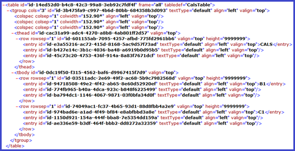
Figure 14‑6: CALS Exchange table stored in Quark XML Author
Table
Many different table definitions have been created to capture a variety of information. This variety of definitions include tables with and without groups, sections and columns. The Quark XML Author configuration schema supports the definition of many standard table variants including CALS Exchange and HTML tables.
This section assumes that you have a working knowledge of the table structure (CALS Exchange, HTML, etc.) that you are represent in Quark XML Author configuration schema. Some structure may be discussed, but for details see their respective specifications.
The CALS Exchange table uses table to support table.
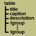
Figure 14‑7: CALS Exchange Table
In the sample configuration, the “CalsTable” Table supports the CALS Exchange table.
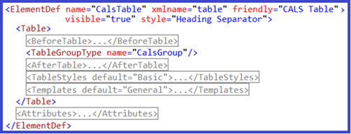
Figure 14‑8: CalsTable defined
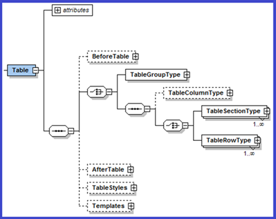
Figure 14‑9: Configuration-XSD Table definition
Quark XML Author supports the following table elements:
-
“Groups”
-
”Sections”
-
“Columns”
-
“Rows”
-
“Cells”
-
“BeforeTable”
-
“AfterTable”
-
“TableStyles”
-
“Templates”
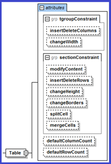
Figure 14‑10: Configuration-XSD Table definition – attributes
Table contains the following attributes:
Table 14‑199: attributes for Table
|
Attribute Name |
Definition |
|
defaultColumnCount |
Default number of columns. Valid values are 1-63. |
|
defaultRowCount |
Default number of rows. |
Table 14‑20: tgroup constraints for Table
|
Attribute Name |
Definition |
|
insertDeleteColumns |
Defaults to allow. If set to deny, the user will not be able to insert or delete columns in the table. |
|
changeWidth |
Defaults to allow. If set to deny, the user will not be able to change column widths in the table. |
section constraints for table
The following constraint attributes may be applied to Table, Tablegroup and Tablesection elements.
Table 14‑201: section constraint attributes for table
|
Attribute Name |
Definition |
|
changeBorders |
Defaults to allow. If set to deny, the user will not be able to modify the borders in the table. |
|
changeHeight |
Defaults to allow. If set to deny, the user will not be able to change row heights in the table. |
|
insertDeleteRows |
Defaults to allow. If set to deny, the user will not be able to insert or delete rows in the table. |
|
mergeCells |
Defaults to allow. If set to deny, the user will not be able to merge cells in the table. |
|
splitCell |
Defaults to allow. If set to deny, the user will not be able to split cells in the table. |
Constraints Inheritance Path
Table elements inherit constraint attribute values from their ancestors according to the following inheritance chain (‘|’ separates siblings):
Table > Group > Column | Section > Row > Cell
In tables without a group defined:
Table > Column | Section > Row > Cell
In tables without sections or a group defined:
Table > Column | Row > Cell
Fixed attribute and tables
The following statement from Table 11‑3: Field Attributes also applies to tables and table elements.
“Assign the fixed attribute to a AttributeType for an element definition to uniquely identify the element among sibling elements that have identical xmlname values. “
To support multiple table elements in the same configuration use the fixed attribute.
For example, to support multiple table definitions in the same configuration make the tabledef attribute fixed and specify a different tabledef value for each definition.
This does not have to be applied to configurations with a single table definition.
Documents that contain unconfigured features
In general, documents that contain unconfigured features are still opened, but no changes pertinent to that feature are allowed. For example, if a document contains merged cells, but that feature is not configured then the existing merged cells are rendered, but no future merges are allowed.
Groups
Quark XML Authors supports table groups. Not all table types use groups.
The CALS Exchange table uses tgroup to support groups.
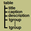
Figure 14‑11: CALS Exchange Table
In the sample configuration, the “CalsGroup” TableGroupType definition supports the CALS Exchange tgroup.
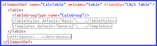
Figure 14‑12: Reference of CalsGroup
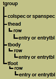
Figure 14‑13: CALS Exchange Table > tgroup
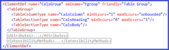
Figure 14‑14: CalsGroup defined
The following configuration schema fragment defines the TableGroup.
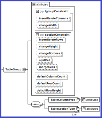
Figure 14‑15: Configuration-XSD TableGroup definition
Tablegroup Constraints
TableGroup contains the following attributes:
Table 14‑212: attributes for Tablegroup
|
Attribute Name |
Definition |
|
defaultColumnCount |
Default number of columns. Valid values are 1-63. |
|
defaultRowCount |
Defines the default number of rows within this group of a new instance of a table. |
|
defaultRowHeight |
Defines the default height of the row within the group. |
Table elements inherit constraint attribute values from their ancestors according to the following inheritance chain. See Constraints Inheritance Path for more information.
Table 14‑223: tgroup constraints for Tablegroup
|
Attribute Name |
Definition |
|
insertDeleteColumns |
Defaults to allow. If set to deny, the user will not be able to insert or delete columns in the tablegroup. |
|
changeWidth |
Defaults to allow. If set to deny, the user will not be able to change column widths in the tablegroup. |
The following constraint attributes may be applied to Table, Tablegroup and Tablesection elements.
Table 14‑234: section constraint attributes for tablegroup
|
Attribute Name |
Definition |
|
changeBorders |
Defaults to allow. If set to deny, the user will not be able to modify the borders in the tablegroup. |
|
changeHeight |
Defaults to allow. If set to deny, the user will not be able to change row heights in the tablegroup. |
|
insertDeleteRows |
Defaults to allow. If set to deny, the user will not be able to insert or delete rows in the tablegroup. |
|
mergeCells |
Defaults to allow. If set to deny, the user will not be able to merge cells in the tablegroup. |
|
splitCell |
Defaults to allow. If set to deny, the user will not be able to split cells in the tablegroup. |
Sections
Quark XML Authors supports table sections. Tables may contain a variety of sections such as header, body and footers sections. Not all table types use sections. CALS Exchange and HTML tables use sections while DITA Simple tables do not.
Header and Body
CALS Exchange tables use thead to support table header, tbody to support table body and tfoot to support table footer sections.
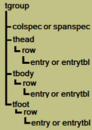
Figure 14‑16: CALS Exchange Table > tgroup
In the sample configuration, the “CalsHeading” TableSectionType definition supports the CALS Exchange thead. The “CalsBody” TableSectionType definition supports the CALS Exchange tbody.
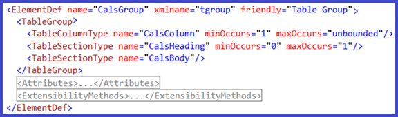
Figure 14‑17: Reference of CalsHeading and CalsBody sections
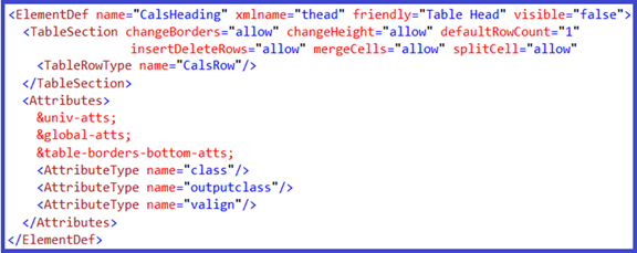
Figure 14‑18: CalsHeading defined
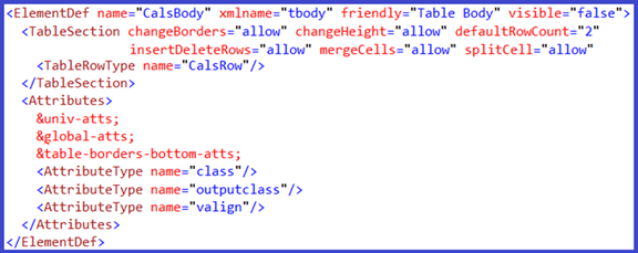
TableSection
The following configuration schema fragment defines the TableSection.
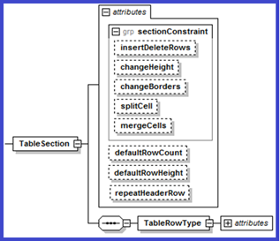
Figure 14‑20: Configuration-XSD TableSection definition
Table elements inherit constraint attribute values from their ancestors according to the following inheritance chain. See Constraints Inheritance Path for more information.
TableSection contains the following attributes:
Table 14‑245: attributes for Tablesection
|
Attribute Name |
Definition |
|
defaultRowCount |
Defines the default number of rows within this section of a new instance of a table. |
|
defaultRowHeight |
Defines the default height of the rows within this section. |
|
repeatHeaderRows |
Boolean. Specifies that the section is a header section. Specifies whether or not the “repeat header rows” feature is enabled. Replaces the deprecated TableHeading Internal Class. |
This needs to be on TableGroup and TableSection attributes.
The following constraint attributes may be applied to table, tablegroup and tablesection elements.
Table 14‑256: section constraint attributes for tablesection
|
Attribute Name |
Definition |
|
changeBorders |
Defaults to allow. If set to deny, the user will not be able to modify the borders in the tablesection. |
|
changeHeight |
Defaults to allow. If set to deny, the user will not be able to change row heights in the tablesection. |
|
insertDeleteColumns |
Defaults to allow. If set to deny, the user will not be able to insert or delete columns in the tablesection. |
|
insertDeleteRows |
Defaults to allow. If set to deny, the user will not be able to insert or delete rows in the tablesection. |
|
mergeCells |
Defaults to allow. If set to deny, the user will not be able to merge cells in the tablesection. |
|
splitCell |
Defaults to allow. If set to deny, the user will not be able to split cells in the tablesection. |
Columns
Quark XML Author supports columns, but does not support column-centric tables. Therefore, HTML colgroup is not supported. Quark XML Author assumes that any given table must have at least one column and ignores any constraints that contradict that requirement.
CALS Exchange uses colspec to support columns.

Figure 14‑21: CALS Exchange table columns stored in Quark XML Author
In the sample configuration, the “CalsColumn” TableColumnType definition supports the CALS Exchange colspec.
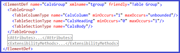
Figure 14‑22: Reference of CalsColumn
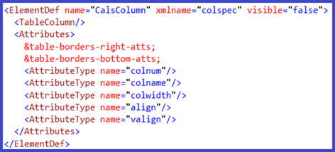
Figure 14‑23: CalsColumn defined
The following configuration schema fragment defines the TableColumn.

Column Resize, Split and Merge Feature Requirements
Quark XML Author only supports the column resize, split and merge features if the following are defined:
-
splitCell constraint attribute is set to allow. See Table 14‑256: section constraint attributes for tablesection.
-
columns are defined, such as the CALS Exchange colspec
-
the column definition includes an attribute with datatype equals tableColumnWidth
-
at least one of the following type attributes exists:
-
tableCellColumnStart, tableCellColumnEnd and tableRowColumnIdentifier. See “Table 11‑7: Field Attributes –datatype values for table rows/columns”. OR
-
tableCellColumnCount. See “Table 11‑8: Field Attributes – datatype values for table cells”. OR
-
tableCellRowCount. See “Table 11‑9: Field Attributes – datatype values for table, group, section”.
-
-
resulting table do not exceed the maxCount of either row or columns (applicable only for split)
In the sample configuration, merge, split and resize of columns are supported.
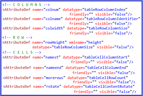
Figure 14‑25: configuration for merge, split and resize of columns
The merge feature uses the mergeCells constraint attribute at the table, group and section levels:
See “Table 14‑201: section constraint attributes for table”.
See “Table 14‑234: section constraint attributes for tablegroup”.
See “Table 14‑256: section constraint attributes for tablesection”.
The merge feature uses the following logic which is based on two patterns. If tableCellColumnStart and tableCellColumnEnd are defined and tableRowColumnIdentifier has a unique value, then horizontal merge is permitted using these three attributes. If not, then Quark XML Author determines if tableCellColumnCount is defined, and if so, horizontal merge is permitted using that attribute. The first pattern is considered the CALS pattern while the second is the HTML pattern.
The following summarizes the datatypes needed for the merge feature.
For HTML,
horizontal:
-
datatype = tableCellColumnCount facilitates colspan
vertical:
-
datatype = tableCellRowSpan facilitates rowspan
<!-- HTML table attributes-->
<AttributeDef name="border" friendly="Border"/>
<AttributeDef name="width" datatype="tableColumnWidth" visible="false"/>
<AttributeDef name="colspan" datatype="tableCellColumnCount" visible="false"/>
<AttributeDef name="rowspan" datatype="tableCellRowSpan" visible="false"/>
For CALS,
horizontal:
-
datatype = tableCellColumnStart facilitates namest
-
datatype = tableCellColumnEnd facilitates nameend
vertical:
-
datatype = tableCellRowCount(deprecated, but for backward compatibility set to tableCellMoreRows)
-
datatype=tableCellMoreRows facilitates morerows
See "Table 11‑8: Field Attributes – datatype values for table cells" for details on datatypes used by the merge feature.
In Quark XML Author version 4.0, if the user creates a table in a Quark XML Author document and the table configuration contains a column definition then column elements such as the HTML colspec are created for the table in the document. However, if a pre-4.0 document is similarly opened, column elements are not created. Therefore in these pre 4.0 tables, the user will not be able to perform the following features: column resize, split and merge.
Column Widths
To be able to change the column width, an attribute with datatype equals tableColumnWidth must be included in the column definition. See Table 11‑9: Field Attributes – datatype values for table, group, section. And changeWidth must be set to “allow”. See Table 14‑20: tgroup constraints for Table.
A table upon which the user has invoked the AutoFit > Fit to Window feature or the template contains 'proportional' units. The xml for these tables will contain column widths expressed in 'proportional' units as indicated by the trailing asterisk.

Figure 14‑26: example xml for Fit to Window feature
If a table does not allow the user to change column widths, but the user inserts or deletes columns, then the user will have to use the columns width that the system calculates after the action.
A table upon which the user has invoked the AutoFit > Fixed Column Width feature or the template contains ‘absolute’ units. The xml for these tables will contain column widths expressed in ‘absolute’ units, such as ‘points’.

Figure 14‑27: example xml for Fixed Column Width feature.
Rows
Some tables store rows in sections. Others store rows at the root of the table.
Some table types use sections to contain rows. Other table types allow rows to exist without sections at the root of the table. The following applies to both table types.
In the sample configuration, the “CalsRow” TableRowType definition supports the CALS Exchange row.

Figure 14‑28: Reference of CalsRow in a section
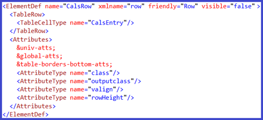
Figure 14‑29: CalsRow defined
The following configuration schema fragment defines the TableRow.
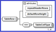
Figure 14‑30: Configuration-XSD TableRow definition
TableRow contains the following attributes:
Table 14‑26: attributes for Tablerow
|
Attribute Name |
Definition |
|
defaultRowHeight |
Defines the default height of the row. |
|
repeatHeaderRows |
Boolean. Specifies whether or not the “repeat header rows” feature is enabled. |
Row Heights
To be able to change the row height width, an attribute with datatype equals tableRowHeight must be included in the row definition. See Table 11‑9: Field Attributes – datatype values for table, group, section. And changeHeight must be set to “allow”. See “Table 14‑201: section constraint attributes for table”.
You may specify the value of changeHeight at each level in the table hierarchy or allow the setting to be inherited: Table, TableGroup and TableSection. See “Table 14‑20: tgroup constraints for Table” for more information. This is useful if you want to create different user experiences. For example, you can create a table configuration where the user can change the height of body rows, but not header rows.
AutoFit
The AutoFit feature is not available when the selection includes any content outside of a table.
Cells
First let’s discuss the authoring experience and content structure within a table cell, then we’ll discuss defining the cell.
Authoring Experience and Content Structure
Many different user experiences can be designed and implemented in Quark XML Author. This holds true both outside of tables and inside of tables. For example, the display of structural indicators for various elements can be toggled on and off (visible attribute = true or false). The display of the table cell structural indicator is also possible, but in the following example we do not display the indicator. The user is not able to enter text in the table cell structural indicator.
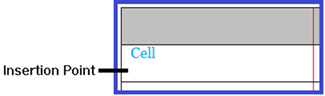
Figure 14‑31: table cell with visual indicator.
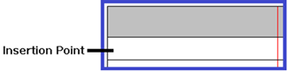
Figure 14‑32: table cell without visual indicator.
The following is an excerpt from the Quark XML Author User Guide. This version of the product does not display a structural indicator for the Cell element.
Authoring in a table cell is similar to authoring on the Word canvas outside of a table. Add new content in each table cell using Insertion Points. You can think of it as authoring in a miniature Word canvas. The content structure for this canvas is the Cell element. A visual indicator for the Cell element is not provided. Regardless, the Cell element is accessible on the Context Menu > Component Menu.
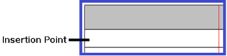
Figure 14‑33: An empty cell
If you want a paragraph at the top of the table cell, simply enter the text. In this situation, the system can be configured to automatically insert a paragraph element into the Cell element. The system can insert other types of content elements depending on the configuration. See “Table 14‑278: TableCell Attributes” for more information on specifying a defaultElement for the TableCell.
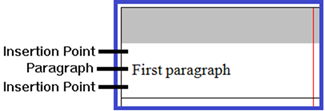
Figure 14‑34: A cell with text only
Otherwise, insert the desired element type in the Insertion Point using standard insert techniques. For example, right-click on the Insertion Point and the Context Menu of allowed elements is displayed.
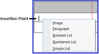
Figure 14‑35: Cells support mixed content.
In our example, we select Bulleted List from the Context Menu.
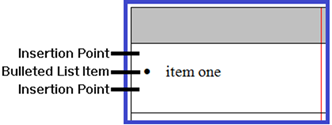
Figure 14‑36: Cells with bulleted list only
The bulleted list is inserted and ready to receive text. We enter “item one”.
Elements inserted in the table cell are children of the Cell.
The content structure for this table is represented as the cell with a child bulleted list.
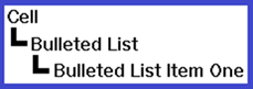
Figure 14‑37: The content structure
If later you decide that you need text at the top of the cell, simply insert a paragraph element in the topmost Insertion Point.
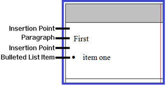
The content structure for this table is represented as the cell with a child paragraph and a child bulleted list.
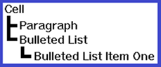
Figure 14‑39: The content structure
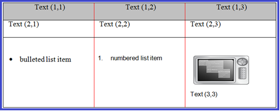
Figure 14‑40: CALS table cells with various content types
The XML of the CALS table in Figure 14‑40 is the following (assumption: nodes are defined as childTextNodes not Paragraphs. See “Paragraph and ChildTextnode Elements”) :
-<table id="_dd2f9581...">
-<tgroup cols="3" id="_18fd38aa..">
 <colspec colsep="1"/>
 <colspec colsep="1"/>
 <colspec colsep="1"/>
-<thead id="_98e2fd05...">
-<row rowsep="1" id="_b03e9318...">
 <entry id="_3c18b0a7...">Text (1,1)</entry>
 <entry id="_51f6bb62...">Text (1,2)</entry>
 <entry id="_651ea15a...">Text (1,3)</entry>
 </row>
 </thead>
-<tbody id="_c9cff7c1...">
-<row rowsep="1" id="_cabff024...">
 <entry id="_a0c9557f...">Text (2,1)</entry>
 <entry id="_13f0110c...">Text (2,2)</entry>
 <entry id="_5cf2483a...">Text (2,3)</entry>
 </row>
-<row rowsep="1" id="_7d2ca11c...">
-<entry id="_3eff3aac..">
-<ul id="_7ab1ac56...">
 <li id="_4f9048b1...">bulleted list item</li>
 </ul>
 </entry>
-<entry id="_2b0c3181...">
-<ol id="_7131af6a...">
 <li id="_0edc9e7e...">numbered list item</li>
 </ol>
 </entry>
-<entry id="_0d668949...">
 <image href="C:\Current\camera_back_menu_96dpi.jpg" height="65" width="122" id="_fab4eff5..."/>
 <p id="_bd16267b...">Text (3,3)</p>
 </entry>
 </row>
 </tbody>
 </tgroup>
 </table>
Cell Definition Overview
For some tables, cell are defined the same (reusable) no matter whether they are in a header, body or footer. For other tables, cell definitions are separate and different for different parent containers.
-
Reusable Cells Definition
-
Body Cell Canvas
-
Header Cells
-
Cell Canvas
Table cells may be configured to contain mixed-content such as paragraphs, lists, and figures. For an example, see the Choice (unbounded) definition in “CALS Exchange Cells”.
Reusable Cell Definitions
Some table structures use section-specific cells or row-specific cells.
If your table structure has sections and the cells within the different section types are similar, you may be able to create a single cell element definition rather than a section-specific cell definition. This is the case with the following CALS Exchange table example.
In the sample configuration, the “CalsEntry” TableCellType definition supports CALS Exchange entry. CalsRow is referenced by both CalsHeading and CalsBody effectively reusing “CalsEntry” in both section types. See “CALS Exchange Header and Body.
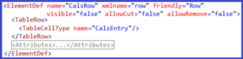
Figure 14‑41: Reference of CalsEntry
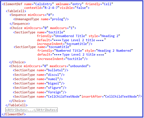
Figure 14‑42: CalsEntry defined
In the sample configuration, the “CellChildTextNode” element definition supports text capture within CALS Exchange entry. Text-based elements specified as childTextnodes are typically used for text capture in table cells. See “Paragraph and ChildTextnode Elements” for more information.
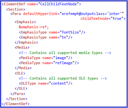
Figure 14‑43: CellChildTextNode defined
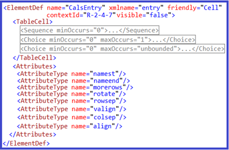
Figure 14‑44: CalsEntry (with attributes) defined
TableCell contains the following attributes:
Table 14‑278: TableCell Attributes
|
Attribute |
Required |
Definition |
|
defaultElement |
no |
Specifies the name of the element that is automatically inserted if the user tabs to a table cell and then types (or pastes text). This should be a para-type. See “Minimizing “empty” cells”. |
|
displayAttribute |
no |
String. Allows you to specify that instead of the element name, the value of the attribute named will be displayed to the user. See Table 14‑2: Section Attributes. |
|
displayElement |
no |
Boolean. If set to true, the display name of the element will be the name of the element's first visible child element. See Table 14‑2: Section Attributes. |
A CALS Exchange cell requires many more attributes to support it than an HTML cell and about twice as many as the Simple Table cell. Xmlname is different. CALS has Attributes. HTML does not.
Minimizing “empty” cells
In order to ensure a consistent and reliable user experience, the system attempts to ensure that new table cells contain some type of content element rather than create what are considered “empty” cells. If the table cell is configured with a required child element then that child element is instantiated or if the table template included content for the table cell then that content is be placed in the cell. If the neither of those scenarios are true then the system checks to see if the table cell is configured with a default element. If so, then the default element is inserted. This applies whether the user inserted a new table, inserted a new row, tabbed to create a new row, pasted content, etc. See defaultElement in “Table 14‑27”.
Paragraph and ChildTextnode Elements
Text is a common content type that users desire to enter in table cells. This content type can be facilitated using two types of content elements: paragraphs and childTextnodes. These elements are configured as children of the table cell. Both support portionmarks. See “Portionmarks”.
Table cell elements are containers only and may not have text stored directly on the cell element. Table cells are strictly containers for child elements. Most table cell configurations use childTextnodes rather than paragraphs. The user experience for paragraphs and childTextnodes is similar. See “childTextnode” for a description of some of the differences.
 Quark strongly recommends that your table cell configurations contain either paragraphs
or childTextnodes, but not both. Though a configuration containing both is technically
possible, the resulting user experience could be confusing. When viewing the list
of insertable content, the user would be presented with both paragraph and childTextnodes.
Until the user learned the subtle differences, this user experience could be frustrating.
The following sample configuration fragment defines a childTextnode within a TableCell > Choice “unbounded”.
<SectionType name="CellChildTextNode" insertAfter="CellChildTextNode"/>
The following sample configuration fragment defines a paragraph within a TableCell > Choice “unbounded”.
<SectionType name="CellPara" insertAfter="CellPara"/>
 If you have a business requirement for text-only table cells you must use childTextnodes.
Configurations of text-only tables cells using paragraphs are not supported. For example,
DITA Choice Table should be configured using childTextnodes.
The serialization of paragraphs and childTextnodes is different. See “Table 14‑3: Para Attributes” for more information.
childTextnodes have the following limitations and differences from a paragraph:
-
Shift-Enter required to create soft line break
-
Adjacent childTextnodes are supported. This allows for the insertAfter attribute to be set such that when the user presses Enter in a childTextnode, a sibling childTextnode is automatically inserted after. See Table 14‑133: SectionType Attributes for more information on insertAfter. This also allows for automatic insertion of childTextnode in the tab and type use case. See default Element and “Table 14‑278: TableCell Attributes” for more information.
-
The “Change To” feature is supported. See “ChangeToList” for more information.
Referencing
Only certain aspects of a table can be configured for referencing in Quark XML Author.
Configurable:
-
tables
-
paragraphs
-
lists
-
images
Not configurable:
-
groups
-
sections
-
rows
-
columns
-
cells
-
textnodes
Cut and Copy
Cut, Copy and Remove is configured the same inside and outside of tables using standard allowCopy and allowCut attributes. See Table 14‑1: ElementDef Attributes for more information.
These features will be available when they do not endanger structural integrity. For example, the user is never allowed to cut a cell from inside of a table.
Configurations with multiple table types
Special consideration should be taken when creating a configuration with multiple table types because the user may attempt to paste content from one table to another table of a different type. The system will allow the paste if the content being pasted is compatible with respect to the configurations of each table. For example, the user may not be able to paste header row content into a table that is not configured for header rows.
Given that the system will deny the user to paste content that is incompatible, the user guide and training materials should be written to provide guidance to the user as to why the paste may have been denied and what is allowed for that specific configuration.
Formatting
Formatting is limited to:
-
alignment: Table 14‑291: tableStyles attributes group
-
borders: Table 14‑291: tableStyles attributes group, Table 14‑302: xpressColumnStyleAttributes group, Table 14‑313: xpressRowStyleAttributes group
-
orientation: See tableCellContentRotate in “Table 11‑8: Field Attributes – datatype values for table cells”
BeforeTable
If you need to define a collection of elements that can exist before a table and are directly associated with that table, then use BeforeTable. <BeforeTable> is a child element of <Table>. See Table.
BeforeTable may contain one or more Sequence or Choice elements, which in turn contain document elements. Each <BeforeTable> node defines a collection of <Sequence> and <Choice> nodes. These are the same Sequence or Choice elements that are used to define content elements outside of tables. See Sequence.
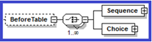
Figure 14‑46: Configuration-XSD BeforeTable definition
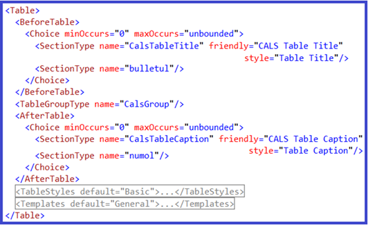
Figure 14‑47: BeforeTable defined
Choice
Each <Choice> node defines a collection of content type nodes.
Sequence
Each <Sequence> node defines a collection of content type nodes.
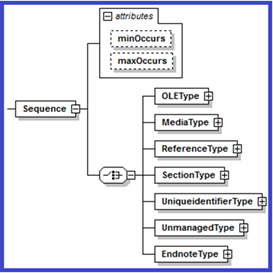
Figure 14‑49: Configuration-XSD Sequence definition
AfterTable
If you need to define a collection of elements that can exist after a table and are directly associated with that table, then use AfterTable. <AfterTable> is a child element of <Table>. See Table.
AfterTable may contain one or more Sequence or Choice elements, which in turn contain document elements. Each <AfterTable> node defines a collection of <Sequence> and <Choice> nodes. These are the same Sequence or Choice elements that are used to define content elements outside of tables. See Sequence.
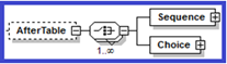
Figure 14‑50: Configuration-XSD AfterTable definition

Figure 14‑51: AfterTable defined
Choice
Each <Choice> node defines a collection of content type nodes.
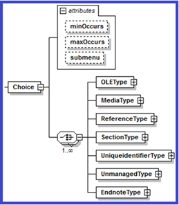
Figure 14‑52: Configuration-XSD Choice definition
Sequence
Each <Sequence> node defines a collection of content type nodes.
TableStyles
The <TableStyles> node contains a collection of <TableStyle> child elements that describe general formatting for tables.
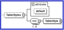
Figure 14‑54: Configuration-XSD TableStyles definition
Table 14‑289: TableStyles Attributes
|
Attribute Name |
Definition |
|
default |
The name of the default TableStyle. |
In the following example, the table style “Basic” is defined. Within the collection of table styles, “Basic” is also specified as the default style.
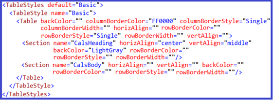
TableStyle
Each <TableStyle> node defines a <Table> node.
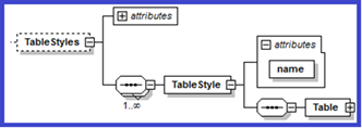
Figure 14‑56: Configuration-XSD TableStyle definition
Table 14‑30: TableStyle Attributes
|
Attribute Name |
Required |
Definition |
|
name |
yes |
The name of the TableStyle. The table element must have a tableStyle attribute.
And in the Template > table definition, set that attribute value to the name of the style. For example, Template/table@myTemplate="My Template", where TableStyle@name="My Template". |
The name attribute identifies the table style within Quark XML Author as well as to the user.
In the Insert Table dialog, the name is displayed adjacent to “Table Style:” indicating the style that was selected by the user in the Table Style dialog. In the following example, the current table style is “Default”. Note that the Styles button is not enabled which indicates that only one Table Style is associated with the “Simple Table” table definition and no other styles are available for selection.
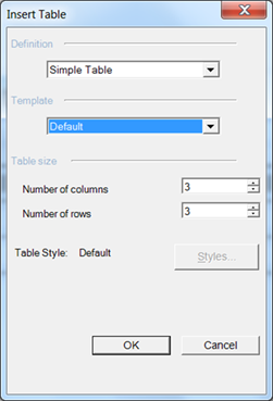
Figure 14‑57: Insert Table dialog displays the current Table Style
In the following example, the Insert Table dialog displays “No Style Selected”. The user can click Styles and in the Table Style dialog select from the multiple styles that are available.
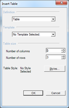
Figure 14‑58: Insert Table dialog with no Table Style selected.
The Table Style dialog displays the names of all table styles associated with the current table definition.
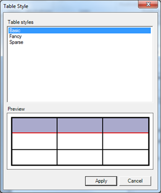
Figure 14‑59: Table Style dialog displays all styles available
Table
Each <Table> node defines a collection of <Section> nodes and a general formatting scheme for a table. <Section> nodes define the appearance of heading and body sections.
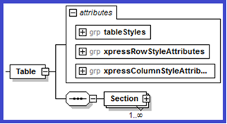
Figure 14‑60: Configuration-XSD Table definition
To specify stylistic information for a <Table>, use <tableStyles>, <xpressColumnStyleAttributes> and <xpressRowStyleAttributes>.
See:
The following stylistic attributes may be applied to the <Table>. See Table for more information.
-
Table 14‑302: xpressColumnStyleAttributes group
The following stylistic attributes may be applied to both the <Table> and <Section>. See Table and Section, respectively.
Table 14‑313: xpressRowStyleAttributes group
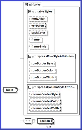
Figure 14‑61: Configuration-XSD Table definition
Section
Each <Section> node defines a general formatting scheme for a section.
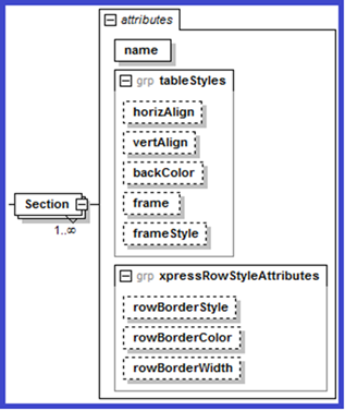
Figure 14‑62: Configuration-XSD Section definition
To specify stylistic information for a <Section>, use <tableStyles> and <xpressRowStyleAttributes>.
See:
-
Table 14‑291: tableStyles attributes group
-
Table 14‑302: xpressColumnStyleAttributes group, Table 14‑313: xpressRowStyleAttributes group
tableStyles attributes group
The following stylistic attributes may be applied to both the <Table> and <Section>. See Table and Section, respectively.
Tables may be configured so that the user can specify a background color. This can be configured at the desired level in the table structure. See backColor.
Tables may be configured so that the user can turn borders on and off. This can be configured at the desired level in the table structure. See frame.
Table 14‑291: tableStyles attributes group
|
Attribute Name |
Required |
Definition |
|
backColor |
no |
The color name to be applied to the background. |
|
frame |
no |
One of six enumerated values that specify which, if any, of the table element’s outer borders will be displayed. The enumerated values are:
|
|
frameStyle |
no |
Defaults to Single. The line type to be used for the table element’s outer borders. |
|
horizAlign |
no |
Defaults to left. The default horizontal alignment of cells within the given table element. Valid values are: left, right, center and justify. |
xpressColumnStyleAttributes group
The following stylistic attributes may be applied to the <Table>. See Table for more information.
Table 14‑302: xpressColumnStyleAttributes group
|
Attribute Name |
Required |
Definition |
|
columnBorderColor |
no |
The color name to be applied to the column border. Defaults to 000000(=black). |
|
columnBorderStyle |
no |
The line type to be used for the table’s column borders. Defaults to Single. For valid values, see lineType in the XpressSchema. |
|
columnBorderWidth |
no |
Integer. Specifies the width of the column border. Defaults to 1px. |
xpressRowStyleAttributes
The following stylistic attributes may be applied to both the <Table> and <Section>. See Table and Section, respectively.
Table 14‑313: xpressRowStyleAttributes group
|
Attribute Name |
Required |
Definition |
|
rowBorderColor |
no |
The color name to be applied to the row border. Defaults to 000000(=black). |
|
rowBorderStyle |
no |
The line type to be used for the region’s row borders. Defaults to Single. For valid values, see lineType in the XpressSchema. |
|
rowBorderWidth |
No |
Integer. Specifies the width of the row border. Defaults to 1px. |
|
vertAlign |
no |
Defaults to top. The default vertical alignment of the table. Valid values are: top, middle and bottom. |
Templates
The <Templates> node contains one or more <Template> child elements that describe a table structure that may be inserted into the document. This node has one attribute: default, the value of which refers to the name of the <Template> child element that is to be used as the default table template.
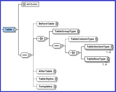
Figure 14‑63: Configuration-XSD Table > Templates definition
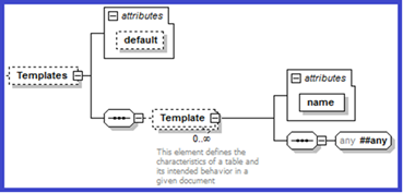
Figure 14‑64: Configuration-XSD Templates definition
Table 14‑324: Templates Attributes
|
Attribute Name |
Definition |
|
default |
The name of the default template. |
Template
Each <Template> node defines a table structure. The name attribute identifies the template within Quark XML Author as well as to the user, in the Insert Table dialog. In the following example, the Inset Table dialog shows that the “TemplateOne” Template that is associated with the “Table” table definition.
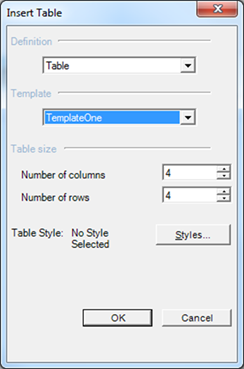
Figure 14‑65: Insert Table dialog displays the selected table Template
The descendant nodes of <Template> define the structure of the table and the content types available.
Table 14‑335: Template Attributes
|
Attribute Name |
Definition |
|
name |
The name of the template. |
In the following example, the table template “General” is defined. Within the collection of table templates, “General” is also specified as the default template.
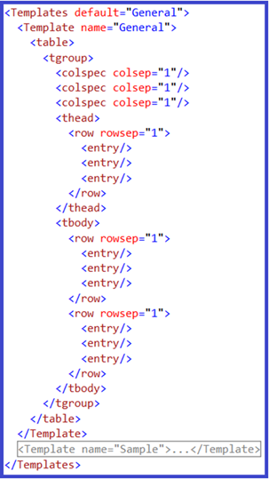
Figure 14‑66: Templates defined
Tab and type behavior
The system can be configured so that when the user tabs to a table cell and then types (or pastes text), an element is automatically inserted. The new element receives the text. Quark recommends using this feature. See “Table 14‑278: TableCell Attributes” for more information on specifying a defaultElement for the TableCell.
Support for language-specific configurations
At startup, Quark XML Author uses the current Microsoft Office Display Language to determine which language to use for authoring sessions. Quark XML Author then loads the appropriate language-specific configuration. To minimize the number of hard coded strings in the configuration files and software, content that should be translated has been centralized in standard Microsoft resource files. The directory structure is shown here:
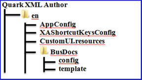
UI controls and features
This section of the guide discusses features and the UI controls to which they are associated. For example, the Find & Replace feature is associated with a menu item, a toolbar button, a ribbon button and a shortcut key.
The text used to display a given UI control is retrieved from the resources file based on the name of the InternalClass. You can override this behavior by specifying attributes such as label and supertip.
For example, in the sample config node, the InternalClass is "Paste".
<InternalClass name="Paste" />
Values for the label, screentip, supertip and keytip components are retrieved from the resource file using the following naming convention for the resource id.
[InternalClass name]_[component name]
The following figure shows the fragment of the resource file for the components associated with the "Paste" InternalClass.
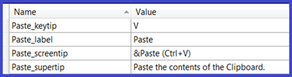
Figure 14‑67: installation folder comparison
Note that the label and keytip attributes are not used in the config node. Their values are retrieved from the Core resource file. (These attributes are deprecated, but backward compatible.) If used these attributes override the Core resource file.
Best Practice: Unless you need to override Core resource values, remove the attributes so that their values are retrieved from the Core resource file. In other words, use Core resources and remove uses of label, title, description, keytip, and screentip.
Best Practice: Id's should match the InternalClass name as closely as possible. For example,
id="PasteXA" should be id="Paste".
The naming convention is actually more robust than previously stated.
[InternalClass name][Type modifier][component name]
The resource id may require additional text to differentiate it when an InternalClass has multiple functions. For example, InsertSectionBreak takes the breakType parameter and is used to create several types of section breaks.
-
InsertSectionBreakContinuous_label
-
InsertSectionBreakNextPage_label
The following figure displays the "Paste" resources in the UI.
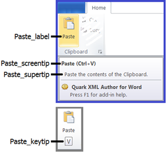
Figure 14‑68: Resources needed for the Paste feature
              <button id="Paste" imageMso="Paste" size="large" >
                <InternalClass name="Paste"/>
                <ShortcutKey key="V" shift="false" ctrl="true"/>
              </button>
Icons
You can use one of the built in Word icons by setting the imageMso attribute to the id of that icon.
<button id="Paste" imageMso="Paste" size="large" >
  <InternalClass name="Paste"/>
  <ShortcutKey key="V" shift="false" ctrl="true"/>
</button>
If you need to specify a custom icon, refer to "Custom Icons".
Context Menus
The Context Menu uses the new language architecture. The Spelling suggestions that are displayed are provided by standard Word for the current language culture. The list of insertable elements is derived from the Friendlies specified in the configuration.
Most of the commands displayed in the ContextMenu come from the following resource file.
ContextMenu.resx
These resources may not be overridden by professional services. These include strings like: Change To, Component, Cut, Edit Comment, Insert Cross-reference, etc.
Resource Files
Only Quark development may add resources to the core resources files. Core resources are compiled into dynamic link libraries (DLLs) that are distributed with the application.
Custom resources may be added by Quark professional services and partners to the custom resource files for (en) and (en-US). Or custom resources may be added to config nodes using attributes that override resource files.
Resource search order
The following describes the process used by the system to locate a specific resource. The system determines if a resource file is present and then looks for a resource in that file. There may be multiple resources available for each language. If the Display Language is English, the system searches resource files in the following order:
|
Dept. Responsible |
Language + Locale |
Source |
Distributed |
|
Professional Services |
en-US |
|
..\en-US\customUI.resources |
|
Professional Services |
en |
|
..\en\customUI.resources |
|
Development |
en-US |
coreUI.en-US.resx |
..\en-US\XA.core.resources.DLL |
|
Development |
en |
coreUI.en.resx |
en\XA.core.resources.DLL |
|
Development |
(default) |
coreUI.resx |
XA.core.DLL |
Compiled resources from Professional Services are standalone resource files. Compiled resources from Development are embedded in the appropriate DLL.
First, the system searches for custom resources specified as local attributes. This is done for each component that is needed in the current version of Word (label, screentip, keytip, etc.). If a component was not specified, then the system searches for custom resources provided by Professional Services. Files are located in the Quark XML Author installation folder or one its subfolders where noted. The system searches for a locale specific custom resource and if none is found then searches for a non-locale specific custom resource. If no custom resources are found the system searches for core resources provided by Development. The system searches for a locale specific core resource and if none is found then searches for a non-locale specific core resource. If none is found the system uses the default resource. The default resource is the fall back position and if this is not found then an exception is thrown. The example uses English, but if the Display Language were another language the resources would be searched in a similar pattern.
Resource Editor
Custom resource files can be edited by professional services with .NET Resourcer. The download on the website is a CLR 4.0 compatible executable which should NOT be used for building the CustomUI.resources file. There is a CLR 2.0 specific version of this available in TFS ($/XML Products/dev/Common/Tools/Resourcer/2.0).
Note: The Lutz resourcer displays culture=neutral for the English version of resource files. This is not a problem and can be ignored.
Custom Strings
To add a custom string, you must add a custom resource to the following resource file.
CustomUI.resources
The following figure shows the resource added for the Paste feature.
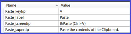
Figure 14‑69: String resources added to CustomUI.resources
Best Practice: For a new feature, add strings for all UI components:
-
keytip
-
label
-
screentip
-
supertip
Adding a custom string
To add a custom icon to resources:
-
In the resource editor, open CustomUI.resources.
-
Click Edit > Insert Text.
-
Set the name match the InternalClass as close as possible plus underscore and then the UI component.
For example, Paste_label.
-
Press Tab.
-
Specify the value of the string.
-
Click File > Save.
The string is added to the resource.
Custom Icons
The following section discusses how to incorporate custom icons.
Many icons displayed in Quark XML Author are the standard Word built in icons.
However, if you need to specify a custom icon for a Word ribbon button or another UI control, you must add the custom icon as a resource to the following icon resource file.
CustomUI.resources
<button id="DocumentOpen" image="DocumentOpen_image" insertAfterMso="FileOpen" visible="true">
  <InternalClass name="DocumentOpen" filter="OpenXA2007QA"/>
</button>
Different from strings, the system will search for icons based on an exact match between the faceId value and the icon id/name in the CustomUI.resources file. In this example the system will search for "DocumentOpen_image".
But be aware that the icon resource file from which the icon is retrieved will be the English specific version of the file.
Adding a custom icon
To add a custom icon to resources:
-
In the resource editor, open CustomUI.resources.
-
Click Edit > Insert Files.
-
Navigate to the folder containing the desired icon file.
-
Select the icon file.
-
Click Open.
-
Select the icon.
-
Press F2.
-
Set the name of the icon to match the InternalClass.
For example, DocumentOpen_image.
-
Click File > Save.
The icon is added to the resource.
Untouchables
There are some resources that may not be changed.
For example, the string "Empty" ("Vacio" in Spanish).
Modifying file filter resource strings
Filter string syntax
The resource ID identifies a string list of filter types. Each filter type comprises two parts: the filter text and the filter definition, which are separated by the pipe character (|).For example, to specify a filter to create a html rendition, you would use the pair shown below as the value of the "HTML Rendition" resource ID:
HTML Rendition = HTML Document (*.html)|*.html
A filter type is comprised of two parts:
-
filter UI label
-
filter definition
In a string that represents a filter type, the filter UI label and filter definition are separated by a pipe (|) character.
For example,
HTML Document (*.html)|*.html
Filter types may contain one or more file extensions. Extensions are separated by a semicolon character. These are the file extensions that Windows will search for and display in the dialog or form.
For example,
Tag Image File Format (*.tif; *.tiff) |*.tif;*.tiff
The Open and Save dialogs contain a list box of filters types and therefore expect you to provide this list in a string. Filter types are separated by a pipe (|) character.
The following is an example of a string containing two filter types. Typically these strings are stored as string resources.
Graphics Interchange Format (*.gif)|*.gif|Tag Image File Format (*.tif; *.tiff)|*.tif;*.tiff
Best practice
For the various Open and Save operations, strings that contain lists of filter types are stored as resource strings. Resource string exists in XML Author's embedded CoreUI resource table and also is stored in the CustomUI.resources file.
When modifying one of these string resources, care must be taken to preserve proper formatting. These strings can be difficult to read as a single long flowing line, therefore it is recommended that you restructure a string into its components with one component per line. The following procedure describes the best way to do this.
Launch a text editor that you can use to edit the string.
Open the CustomUI.resources file using resourcer.
Locate and copy the desired file filter resource.
Paste the resource string into the text editor.
[ORIGINAL STRING]
All Pictures (*.emf;*.wmf;*.jpg;*.jpeg;*.jfif;*.jpe;*.png;*.bmp;*.dib;*.rle;*.gif;*.tif;*.tiff;)|*.emf;*.wmf;*.jpg;*.jpeg;*.jfif;*.jpe;*.png;*.bmp;*.dib;*.rle;*.gif;*.tif;*.tiff;|Windows Enhanced Metafile (*.emf)|*.emf|Windows Metafile (*.wmf)|*.wmf|JPEG File Interchange Format (*.jpg; *.jpeg; *.jfif; *.jpe)|*.jpg;*.jpeg;*.jfif;*.jpe|Portable Network Graphics (*.png)|*.png|Windows Bitmap (*.bmp; *.dib; *.rle;)|*.bmp;*.dib;*.rle|Graphics Interchange Format (*.gif)|*.gif|Tag Image File Format (*.tif; *.tiff)|*.tif;*.tiff
For each pipe '|' character, place the cursor to the left of the pipe character and press Enter so that each component is on a separate line.
For example,
[INITIAL FORMATTING]
All Pictures (*.emf;*.wmf;*.jpg;*.jpeg;*.jfif;*.jpe;*.png;*.bmp;*.dib;*.rle;*.gif;*.tif;*.tiff;)
|*.emf;*.wmf;*.jpg;*.jpeg;*.jfif;*.jpe;*.png;*.bmp;*.dib;*.rle;*.gif;*.tif;*.tiff;
|Windows Enhanced Metafile (*.emf)
|*.emf
|Windows Metafile (*.wmf)
|*.wmf
|JPEG File Interchange Format (*.jpg; *.jpeg; *.jfif; *.jpe)
|*.jpg;*.jpeg;*.jfif;*.jpe
|Portable Network Graphics (*.png)
|*.png
|Windows Bitmap (*.bmp; *.dib; *.rle;)
|*.bmp;*.dib;*.rle
|Graphics Interchange Format (*.gif)
|*.gif
|Tag Image File Format (*.tif; *.tiff)
|*.tif;*.tiff
In the next formatting step we will align the filter elements to clearly show how each filter is constructed.
[COMPLETED FORMATTING]
All Pictures (*.emf;*.wmf;*.jpg;*.jpeg;*.jfif;*.jpe;*.png;*.bmp;*.dib;*.rle;*.gif;*.tif;*.tiff;)
|*.emf;*.wmf;*.jpg;*.jpeg;*.jfif;*.jpe;*.png;*.bmp;*.dib;*.rle;*.gif;*.tif;*.tiff;;
|Windows Enhanced Metafile (*.emf)
|*.emf
|Windows Metafile (*.wmf)
|*.wmf
|JPEG File Interchange Format (*.jpg; *.jpeg; *.jfif; *.jpe)
|*.jpg;*.jpeg;*.jfif;*.jpe
|Portable Network Graphics (*.png)
|*.png
|Windows Bitmap (*.bmp; *.dib; *.rle;)
|*.bmp;*.dib;*.rle
|Graphics Interchange Format (*.gif)
|*.gif
|Tag Image File Format (*.tif; *.tiff)
|*.tif;*.tiff
Removing support for a file type:
In the following example, let's remove support for Tag Image File Format (*.tif,*.tiff) files.
Remove the individual 'Encapsulated PostScript' filter.
DELETE THIS LINE | Tag Image File Format (*.tif; *.tiff)
DELETE THIS LINE |*.tif;*.tiff
Remove the tif file specification from the 'All Pictures' filter.
EDIT THIS LINE All Pictures (*.emf;*.wmf;*.jpg;*.jpeg;*.jfif;*.jpe;*.png;*.bmp;*.dib;*.rle;*.gif;)
EDIT THIS LINE |*.emf;*.wmf;*.jpg;*.jpeg;*.jfif;*.jpe;*.png;*.bmp;*.dib;*.rle;*.gif;
Adding support for a file type:
In the following example, let's add support for compressed Windows Metafiles (*.EMZ and *.WMZ)
Add entries for EMZ and WMZ files to the 'All Pictures' filter.
EDIT THIS LINE All Pictures (*.emf;*.emz;*.wmf;*.wmz;*.jpg;*.jpeg;*.jfif;*.jpe;*.png;*.bmp;*.dib;*.rle;*.gif;*.tif;*.tiff;)
EDIT THIS LINE |*.emf;*.emz;*.wmf;*.wmz;*.jpg;*.jpeg;*.jfif;*.jpe;*.png;*.bmp;*.dib;*.rle;*.gif;*.tif;*.tiff;
A entries to each of the Windows Metafile filters.
EDIT THIS LINE |Windows Enhanced Metafile (*.emf;*.emz;)
EDIT THIS LINE |*.emf;*.emz;
EDIT THIS LINE |Windows Metafile (*.wmf;*.wmz;*)
EDIT THIS LINE |*.wmf;*.wmz;*
After adding and/or editing each of the appropriate filters, examine the results. Note that the file specifications are still aligned with their corresponding filter descriptions. We are now ready to restructure the components into single filter string by deleting all of the carriage returns that we added.
[POST EDIT RESULTS]
All Pictures (*.emf;*.emz;*.wmf;*.wmz;*.jpg;*.jpeg;*.jfif;*.jpe;*.png;*.bmp;*.dib;*.rle;*.gif;*.tif;*.tiff;)
|*.emf;*.emz;*.wmf;*.wmz;*.jpg;*.jpeg;*.jfif;*.jpe;*.png;*.bmp;*.dib;*.rle;*.gif;*.tif;*.tiff;
|Windows Enhanced Metafile (*.emf;*.emz;)
|*.emf;*.emz;
|Windows Metafile (*.wmf;*.wmz;*)
|*.wmf;*.wmz;*
|JPEG File Interchange Format (*.jpg; *.jpeg; *.jfif; *.jpe)
|*.jpg;*.jpeg;*.jfif;*.jpe
|Portable Network Graphics (*.png)
|*.png
|Windows Bitmap (*.bmp; *.dib; *.rle;)
|*.bmp;*.dib;*.rle
|Graphics Interchange Format (*.gif)
|*.gif
|Tag Image File Format (*.tif; *.tiff)
|*.tif;*.tiff
Left align each filter element and remove blank lines as shown here.
[LEFT ALIGNED]
All Pictures (*.emf;*.emz;*.wmf;*.wmz;*.jpg;*.jpeg;*.jfif;*.jpe;*.png;*.bmp;*.dib;*.rle;*.gif;*.tif;*.tiff;)
|*.emf;*.emz;*.wmf;*.wmz;*.jpg;*.jpeg;*.jfif;*.jpe;*.png;*.bmp;*.dib;*.rle;*.gif;*.tif;*.tiff;
|Windows Enhanced Metafile (*.emf;*.emz;)
|*.emf;*.emz;
|Windows Metafile (*.wmf;*.wmz;*)
|*.wmf;*.wmz;*
|JPEG File Interchange Format (*.jpg; *.jpeg; *.jfif; *.jpe)
|*.jpg;*.jpeg;*.jfif;*.jpe
|Portable Network Graphics (*.png)
|*.png
|Windows Bitmap (*.bmp; *.dib; *.rle;)
|*.bmp;*.dib;*.rle
|Graphics Interchange Format (*.gif)
|*.gif
|Tag Image File Format (*.tif; *.tiff)
|*.tif;*.tiff
Join all of the components into a single line. Make sure that all but the very first line have a pipe '|' character at the beginning of the line prior to joining. Note that the following line may be wrapped, but is a single line of text.
[REASSEMBLED FILTER STRING]
All Pictures (*.emf;*.emz;*.wmf;*.wmz;*.jpg;*.jpeg;*.jfif;*.jpe;*.png;*.bmp;*.dib;*.rle;*.gif;*.tif;*.tiff;)|*.emf;*.emz;*.wmf;*.wmz;*.jpg;*.jpeg;*.jfif;*.jpe;*.png;*.bmp;*.dib;*.rle;*.gif;*.tif;*.tiff;|Windows Enhanced Metafile (*.emf;*.emz;)|*.emf;*.emz;|Windows Metafile (*.wmf;*.wmz;*)|*.wmf;*.wmz;*|JPEG File Interchange Format (*.jpg; *.jpeg; *.jfif; *.jpe)|*.jpg;*.jpeg;*.jfif;*.jpe|Portable Network Graphics (*.png)|*.png|Windows Bitmap (*.bmp; *.dib; *.rle;)|*.bmp;*.dib;*.rle|Graphics Interchange Format (*.gif)|*.gif|Tag Image File Format (*.tif; *.tiff)|*.tif;*.tiff
The final step is to update the resource file.
copy the edited file filter string in the text editor and paste in back to CustomUI.resources and save the resource file.
Extensibility Methods
With some elements, you may want to provide a way for users to access a tool such as a metadata wizard via a command in the context menu. An element definition may use an extensibility method to provide this functionality.
The syntax for using Extensibility Methods is shown below:
<ExtensibilityMethods>
  <ExtensibilityMethod id="method name" friendly="friendly name" showInComponentContextMenu="true or false" showInContextMenu="true or false" faceID="#"/>
</ExtensibilityMethods>
Table 14‑346: ExtensibilityMethod Attributes
|
Attribute Name |
Required |
Definition |
|
enableXpath |
no |
Value is a Boolean XPath expression which evaluates to a node-set in which false is returned for an empty node-set and true otherwise. When applied to the runtime element, indicates whether to enable the method on the Context Menu. Namespaces are not supported in the xpath syntax. For the Ribbon, enableXpath on evaluates against root notes. Against current node is not supported. |
|
faceID |
no |
Allows you to specify an icon that will be displayed next to the context menu item. The value of faceId is an integer corresponding to the ID number of an icon in the Word template FaceID.dot. |
|
friendly |
no |
Specifies a name for the context menu command. |
|
id |
yes |
Specifies the ID of the EI method to be called. |
|
showInComponentContextMenu |
No |
Defaults to true. When set to false, the command will not appear in the Component context menu. |
|
showInContextMenu |
No |
Defaults to true. When set to false, the command will not appear in the main context menu, but may still appear in the Component context menu if showInComponentContextMenu is set to true. |
|
showXPath |
no |
Value is an XPath expression which evaluates to a node-set, and when applied to the current element, indicates whether to include the method on the context menu: if a node-set is returned, the method is included; if an empty node-set is returned, the method is omitted. When applied to the runtime element, indicates whether to include the method on the Context Menu. The XPath expression is applied to the XOM therefore the names are XOM element names. The XPath expression will be evaluated against the current runtime element and thus must be relative to it. Namespaces are not supported in the xpath syntax. For example, showXPath="self::node()[local-name()='Section']". XML Author does not support dynamic show/hide of Ribbon items, therefore showXPath is not applicable for Ribbon items.
|
See Section 6 for more information on how to configure Extensibility Interface methods.