
Configuration: Ribbon, Office Menu, and Backstage View
Ribbons, Office button menus, menu items and Backstage views can be defined and modified in both the AppConfig and DocConfig files, and the procedures are the same in both files.
Configuring Quark XML Author for Microsoft Word requires adding a new node (<ribbon>) to AppConfig.xml and, if multiple ribbon configuration support is needed, the DocConfig file as well.
Single and Multiple Ribbon Configurations
Single Ribbon
If a single ribbon configuration is required, the entire ribbon can be configured in AppConfig.xml. This includes:
-
Defining the tabs that will be visible in the standard Word interface (i.e., no document is loaded or the current active document is not a Quark XML Author document).
-
Defining the Quark XML Author tabs that will be visible when a Quark XML Author document is the active document.
-
Defining the controls on Quark XML Author tabs that will be visible when a Quark XML Author document is the active document.
Multiple Ribbons
If multiple ribbon configurations are necessary, ribbon configuration is split between AppConfig.xml and the DocConfig file. Global UI definitions are placed in the <Ribbon> node in AppConfig.xml. This includes:
-
Defining the tabs that will be visible in the standard Word interface (i.e., no document is loaded or the current active document is not a Quark XML Author document).
-
Defining the Quark XML Author tabs which appear in all ribbon configurations when a Quark XML Author document is the active document.
-
Defining the controls on Quark XML Author tabs which appear in all ribbon configurations when a Quark XML Author document is the active document.
Each DocConfig file defines a separate ribbon configuration. The <Ribbon> node in the DocConfig file defines only those tabs and controls that are visible for that ribbon configuration. This includes:
-
Defining tabs that will only be visible for a specific ribbon configuration.
-
Defining controls that will only be visible for a specific ribbon configuration.
Example
For example, assume two document classes. Class A may contain tables. Class B cannot. This necessitates the following configuration structure:
-
The <Ribbon> node in AppConfig.xml would define the Quark XML Author version of the Insert tab and specify that it only appears when a Quark XML Author document is the active document.
-
The <Ribbon> node in AppConfig.xml would specify that the native Word Insert tab not appear when a Quark XML Author document is the active document.
-
The <Ribbon> node in the DocConfig for Class A would contain a button for inserting tables.
-
The <Ribbon> node in the DocConfig for Class B would not contain a button for inserting tables.
In this example, the resource file contains the strings for the XML Author Insert tab label and the Insert Table button's label, description, screentip, and keytip.
Ribbon Strings and Resources
In addition, the resource file must be populated with the strings for user interface labels, titles, descriptions, screentips, and keytips.
Specify the various attributes by concatenating the control's id value with an underscore followed by the attribute name. Consider the following menu item:
<menu id="XMLAuthor" image="QuarkXMLAuthor.ico" insertBeforeMso="FileNew" itemSize="large"
                                 visible="true">
To specify label and title values, add the following entries to the resource file:
XMLAuthor_label = "New XML"
XMLAuthor_title = "New Business Document"
This resource file is created and compiled the same as other resource files.
Word Backstage View
The <backstage> node defines the items that appear in the Word File menu. The <backstage> node is a child of <Ribbon>\<customUI>. See 4.4.14 for details.
The example below is specific for Word 2010 Backstage View
<Ribbon>
<customUI>
      <backstage>
            </backstage>
</customUI>
</Ribbon>
The example below is specific for the Backstage View in Word 2013 or later.
<Ribbon>
<customUI>
      <backstage2013>
            </backstage2013>
</customUI>
</Ribbon>
Ribbon Nodes
The <Ribbon> node follows immediately after the <CommandBars> element in AppConfig.xml and in the DocConfig file.
The general structure of the <Ribbon> node looks like the XML shown below. The xmlns attribute should be the first attribute.
<Ribbon>
      <customUI xmlns="http://schemas.microsoft.com/office/2006/01/customui" onLoad="OnLoad" loadImage="LoadImage">
            <commands>
                  <!-- one or more command nodes -->
            </commands>
            <ribbon>
                  <!-- all of the nuts and bolts of the office menu and ribbon tabs -->
            </ribbon>
      </customUI>
</Ribbon>
The following subsections describe each available node in alphabetical order.
Icon IDs for use in imageMso
For several of the user interface controls on the ribbon, the imageMso attribute contains the id value of the image displayed on a ribbon button by Word. These values (or names) may be found in the following Microsoft article:
“2016 Office System Document: Lists of Control IDs”
The article states “These names are also accessible within the 2016 product by hovering over controls in the QAT customization dialog, and looking at the screentip of the control.” The article also contains a link to download collection of spreadsheets which contain these values for use in the imageMso attribute.
Or you can view these icons and their values in Microsoft Excel in the Developer tab of the Ribbon.
To display the Developer tab in the Excel Ribbon:
-
Click the Application button, then click Excel Options.
-
In the Excel Options dialog, click Popular.
-
Check Show Developer tab in the Ribbon.
-
Click OK.

Figure 4‑1: Excel Ribbon – Developer tab
-
Click a Gallery button.
-
In the Gallery drop down, click the desired icon.
-
In the imageMso dialog, record the imageMso value for the selected icon. For example “AcceptInvitation”.
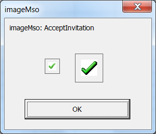
Figure 4‑2: The imageMso dialog displays the icon’s value
<box>
The <box> node can be used to collect a series of controls within the <group> node into a vertical or horizontal box.
Common Attributes
The <box> node uses the required attribute id.
Unique Attributes
The <box> node uses the unique attribute described in Table 4‑1.
Table 4‑1: <box> Attributes
|
Attribute |
Value |
Required |
Description |
|
boxStyle |
horizontal|vertical |
yes |
Defines the orientation of the box. |
Child of
The <box> node may be a child of the following element:
-
<group>
Parent of
The <box> node may contain one or more of the following elements:
-
<button>
-
<buttonGroup>
-
<checkBox>
-
<command>
-
<menu>
-
<splitButton>
-
<toggleButton>
Example
The example below contains two dropdown lists and a button group in a horizontal row.
<box id="StyleEmphasisDropdowns" boxStyle="horizontal">
  <dropDown id="StylesListXA" showLabel="false" sizeString="XXXXXXXXXXXXXXXXXXXXXXXX">
    <!-- Control details ommitted -->
  </dropDown>
  <dropDown id="EmphasisListXA" showLabel="false" sizeString="XXXXXXXXXXXXXXXX">
    <!-- Control details ommitted -->
  </dropDown>
</box>
<button>
The <button> node defines a button control.
To use a native Word button, specify a value for the idMso attribute. The specified Word button is then used without modification; the <button> node for this type of button is a leaf node.
To define a Quark XML Author button, specify a value for the id attribute. Child elements define the button behavior.
Common Attributes
The <button> node uses the following “Common Attributes”:
-
id or idMso (required)
-
image
-
imageMso
-
insertAfterMso
-
showLabel
-
size
-
visible
The following common attributes for the <button> node may still be used but have been deprecated:
-
description
-
label
-
screentip
Define these values in the “Resource Files”.
Child of
The <button> node may be a child of the following nodes:
-
<box>
-
<buttonGroup>
-
<group>
-
<menu>
-
<officeMenu>
-
<splitButton>
Parent of
The <button> node may contain the following nodes:
-
<InternalClass>
-
<ExtensibilityMethod>
-
<ShortcutKey>
These nodes define the behavior of the control and are defined in the System Admin Guide.
Example
In the example below, the button invokes the "PasteChart" Extensibility Method and can also be triggered with the shortcut key Ctrl + V.
<button id="PasteChartXA" imageMso="Paste" size="large" label="Paste Chart”>
      <ExtensibilityMethod id="PasteChart"/>
      <ShortcutKey key="V" shift="false" ctrl="true"/>
</button>
<buttonGroup>
The <buttonGroup> node contains a collection of one or more buttons or toggle buttons.
Common Attributes
The <buttonGroup> node uses the required attribute <id.>
Child of
The <buttonGroup> node may be a child of <box>.
Parent of
The <buttonGroup> node may contain the following nodes:
-
<button>
-
<toggleButton>
Example
In the example below, the <buttonGroup> contains three toggle buttons.
<buttonGroup id="BoldItalicUnderlineGroup">
      <toggleButton id="Bold" imageMso="Bold" showLabel="false">
            <!-- Control details ommitted -->
      </toggleButton>
      <toggleButton id="Italic" imageMso="Italic" showLabel="false">
            <!-- Control details ommitted -->
      </toggleButton>
      <toggleButton id="Underline" imageMso="Underline" showLabel="false">
            <!-- Control details ommitted -->
      </toggleButton>
</buttonGroup>
In the example below, the Toggle Empties button is used to allow a Quark XML Author user to view Empties on the canvas. This approach enables a legacy Quark XML Author user to visualize the layout.
<buttonGroup id="ToggleEmpties">
<toggleButton id="HideEmpties"
   imageMso="SizeToControlHeight"
   showLabel="false">
<InternalClass name=”ToggleEmpty”/>
</toggleButton>
</buttonGroup>
This EmptiesInaccessible element contain a value of either true or false (default). This allows the user to hide and show Empties.
An example is shown below:
<EmptiesInaccessible>true</ EmptiesInaccessible >
<checkBox>
The <checkBox> node is used to specify a check box control.
Common Attributes
The <checkBox> node uses the following “Common Attributes”:
-
id or idMso (Required)
-
image or imageMso
-
showLabel
-
size
The following common attributes for the <toggleButton> node may still be used but have been deprecated:
-
keytip
-
label
-
screentip
To define these values, use the Resources file.
Child of
The <checkBox> node may be a child of the following nodes:
-
<box>
-
<group>
Example
In the example below, the native Word checkbox for viewing the Document Map is defined.
<checkBox idMso="ViewDocumentMap"/>
<command>
The <command> node defines the behavior for a standard Word command. It can globally override Word functionality or only apply when a Quark XML Author document is active.
The <command> node always uses the idMso attribute rather than the id attribute because it always points to a native Word command.
To disable a command, specify the command without a repurpose designation.
For example,
<command idMso="MyCommand"/>
To repurpose a command, specify the command with a repurpose designation.
For example,
<command idMso="FileSave">
<InternalClass name="DocumentSave" nativeFormat="false" filter="Save2007"/>
</command>
The visibility of a command is specified at the individual user interface control.
Common Attributes
The <command> node uses the required attribute idMso.
Child of
The <command> node may be a child of the node <commands>
Parent of
The <command> node may contain the following nodes:
-
<ExtensibilityMethod>
-
<InternalClass>
-
<ShortcutKey>
These nodes define the behavior of the control and are defined in the System Admin Guide.
Examples
In the following example, setting visible="xa" indicates that the functionality of the native Word command FileSave will be overridden whenever it is invoked from within a Quark XML Author document.
<command idMso="FileSave" visible="xa">
      <ShortcutKey key="S" shift="false" ctrl="true"/>
      <InternalClass name="DocumentSave" nativeFormat="false" filter="Save2007"/>
</command>
In the following example, setting visible="true" indicates that the native Word command will always be available. As a result, "FileClose" would not need to be specifically defined as part of the Office Menu in the <officeMenu> node.
<command idMso="FileClose" visible="true"/>
<commands>
The <commands> node contains a collection of <command> nodes that specifies native Word functionality on a global level.
Common Attributes
The <commands> node uses no attributes:
Child of
The <commands> node may be a child of the node <customUI>
Parent of
The <commands> node may contain the node <command>
Example
<commands>
      <command idMso="FileSave" visible="xa">
            <ShortcutKey key="S" shift="false" ctrl="true"/>
            <InternalClass name="DocumentSave" nativeFormat="false" filter="Save2007"/>
      </command>
      <command idMso="FileClose" visible="true"/>
      <command idMso="ApplicationOptionsDialog"/>
      <command idMso="Help" visible="xa">
            <ExtensibilityMethod id="About"/>
      </command>
</commands>
<contextualTabs>
Word has contextual tabs for Table Tools and Pictures Tools. The items on these tabs can break the Quark XML Author document structure and must be suppressed. Add the XML snippet below after the <tabs> node to suppress these contextual tabs when a Quark XML Author document is the active document.
<contextualTabs>
      <tabSet idMso="TabSetTableTools" visible="Word"/>
      <tabSet idMso="TabSetPictureToolsClassic" visible="Word"/>
</contextualTabs>
<customUI>
The <customUI> node contains all of the command and ribbon definitions.
Common Attributes
The <customUI> node must have the following structure. The xmlns attribute should be the first attribute.
<customUI xmlns="http://schemas.microsoft.com/office/2006/01/customui" onLoad="OnLoad" loadImage="LoadImage">
Child of
The <customUI> node is the child of <Ribbon>
Parent of
The <customUI> contains the following nodes:
-
<commands>
-
<ribbon>
Example
      <customUI xmlns="http://schemas.microsoft.com/office/2006/01/customui" onLoad="OnLoad" loadImage="LoadImage">
            <commands>
                  <!-- one or more command nodes -->
            </commands>
            <ribbon>
                  <!-- all of the nuts and bolts of the office menu and ribbon tabs -->
            </ribbon>
      </customUI>
<dropDown>
The <dropDown> node defines the following attributes:
Common Attributes
The <dropDown> node uses the following “Common Attributes”:
-
id (Required)
-
showLabel
-
sizeString
The following common attributes for the <dropDown> node may still be used but have been deprecated:
-
label
To define these values, use the Resources file.
Child of
The <dropDown> node may be a child of the following nodes:
-
<box>
-
<group>
Parent of
The <dropDown> node may contain the following nodes:
-
<InternalClass>
These nodes define the behavior of the control and are defined in the System Admin Guide.
Example
<dropDown id="StylesListXA" showLabel="false" sizeString="XXXXXXXXXXXXXXXXXXXXXXXX">
      <InternalClass name="StyleHandler"/>
</dropDown>
<group>
Controls on each ribbon tab are organized into logical groups. In Figure 4‑3, the Quark XML Author Home tab is shown with three groups: Clipboard, Styles, and Editing.
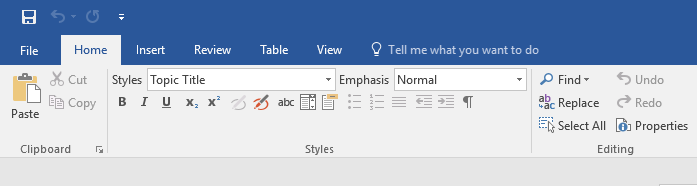
Figure 4‑3: Home tab with three groups
The <group> node defines each group on a tab and contains all the other controls.
Common Attributes
The <group> node uses the following “Common Attributes”:
-
id or idMso (required)
-
insertAfterMso (optional)
-
insertBeforeMso (optional)
-
visible (optional)
The following common attributes for the <group> node may still be used but have been deprecated:
-
label
To define these values, use the Resources file.
Child of
The <group> node may be a child of the following element:
-
<tab>
Parent of
The group node may contain any of the following control nodes.
-
<box>
-
<button>
-
<command>
-
<menu>
-
<splitButton>
-
<toggleButton>
Each of these nodes is discussed in Section 4.2.
Example
The example below shows a group containing three buttons.
<group id="CopyPasteXA">
      <button id="PasteXA" imageMso="Paste" size="large">
            <!-- Control details ommitted -->
      </button>
      <button id="CutXA" imageMso="Cut">
            <!-- Control details ommitted -->
      </button>
      <button id="CopyXA" imageMso="Copy">
            <!-- Control details ommitted -->
      </button>
</group>
<menu>
The <menu> node defines a menu with the Office menu, a ribbon tab, or a split button.
To use a native Word menu, specify a value for the idMso attribute.
To define a custom menu, specify a value for the id attribute.
Common Attributes
The <menu> node uses the following “Common Attributes”:
-
id or idMso (required)
-
image or imageMso
-
insertBeforeMso
-
itemSize
-
size
-
visible
The following common attributes for the <menu> node may still be used but have been deprecated:
-
keytip
-
label
-
screentip
-
title
To define these values, use the Resources file.
Unique Attributes
The <menu> node may also use the unique attribute described in Table 4‑1.
Table 4‑2: <menu> Attributes
|
Attribute |
Value |
Description |
|
itemSize |
large |
Display size of the menu item. Defaults to small. |
Child of
The <menu> node may be a child of the following nodes:
-
<box>
-
<group>
-
<officeMenu>
-
<splitButton>
Parent of
The <menu> node may contain the following nodes:
-
<button>
-
<toggleButton>
Example
The example below presents a menu with two buttons.
<menu id="FileSendXAMenu" image="export-to-xml-icon.ico" insertBeforeMso="FilePrepareMenu" itemSize="large" visible="XA">
      <button id="FileExportToIE" imageMso="WebPagePreview">
            <!-- Control details ommitted -->
      </button>
      <button id="FileSendAsXmlAttachment" imageMso="FileSendAsAttachment">
            <!-- Control details ommitted -->
      </button>
</
menu
>
<menuSeparator>
The <menuSeparator> node forces a separation line to appear between menu items.
Common Attributes
The <menuSeparator> node uses the following “Common Attributes”:
-
id (Required)
Child of
The <menuSeparator> node may be a child of the following nodes:
-
<menu>
-
<officeMenu>
Parent of
The <menuSeparator> node may not contain any child nodes.
Example
In the example below, the highlighted node causes a separation line to appear before the FileOpen button.
<menu id="XpressAuthor" image="QuarkXMLAuthor.ico" insertBeforeMso="FileNew" itemSize="large" visible="true">
      <button id="NewTopic" image="topic-icon.ico" visible="true">
            <!-- Control details ommitted -->
      </button>
      <button id="NewTask" image="task-icon.ico" visible="true">
            <!-- Control details ommitted -->
      </button>
      <button id="NewConcept" image="concept-icon.ico" visible="true">
            <!-- Control details ommitted -->
      </button>
      <button id="NewReference" image="reference-icon.ico" visible="true">
            <!-- Control details ommitted -->
      </button>
      <menuSeparator id="FileOpenSeparator"/>
      <button id="FileOpen" image="open-xa-icon.ico" visible="true">
            <!-- Control details ommitted -->
      </button>
</menu>
Word Backstage View
Just as we had the ability to customize the Word 2007 Office menu, we have the ability to customize the Word Backstage view (File menu).
The following overview is an excerpt from the “Introduction to the Office 2010 Backstage View for Developers” article ©Microsoft:
“In the 2007 release of the Microsoft Office system, file-level functionality was accessible on the Office menu that was available by clicking the Office button.
“In Microsoft Office 2010 and 2013, the Office button is replaced by a File tab. Clicking the File tab takes you to the Microsoft Office Backstage view.
“Backstage view is fully extensible by developers, permitting organizations to customize the user interface (UI) to suit their own needs. And best of all, the Backstage UI is customizable by using the same files, callbacks, and many of the controls used in the Ribbon. This means that developers already familiar with customizing the Ribbon UI can use those same skills to create a Backstage UI targeted at the needs of their organization.”
Additional information:
The <backstage> node defines the items that appear on the Word File menu. The Word File menu may have any combination of menus, buttons, and split buttons. Quark recommends that Quark XML Author configurations mimic, as much as possible, the native Word interface. Thus the Word File menu should be defined to present the same menu items that are present in standard Word, with the Quark XML Author items at the top.
This solution is taken from the VSTO2010 documentation, however unlike the Microsoft samples, Quark XML Author only uses the in-document UI customization.
The following is a fragment from AppConfig file for Backstage 2010 that illustrates where <backstage> resides in the <Ribbon>\<customUI>structure.
<Ribbon>
      <customUI xmlns="http://schemas.microsoft.com/office/2006/01/customui" onLoad="OnLoad" loadImage="LoadImage">
            <commands>
                  <!-- one or more command nodes -->
            </commands>
            <ribbon>
            <!-- nuts and bolts of the office menu and ribbon tabs -->
      <ribbon startFromScratch="false">
      <officeMenu>
      </officeMenu>
      <tabs>
      </tabs>
      <contextualTabs>
      </contextualTabs>
      </ribbon>
<!-- nuts and bolts of the backstage view  -->
      <backstage>
            </backstage>
</customUI>
</Ribbon>
The following is a fragment from AppConfig file for Backstage 2013
that illustrates where <backstage> resides in the <Ribbon>\<customUI>structure.
<Ribbon>
      <customUI xmlns="http://schemas.microsoft.com/office/2006/01/customui" onLoad="OnLoad" loadImage="LoadImage">
            <commands>
                  <!-- one or more command nodes -->
            </commands>
            <ribbon>
            <!-- nuts and bolts of the office menu and ribbon tabs -->
      <ribbon startFromScratch="false">
      <officeMenu>
      </officeMenu>
      <tabs>
      </tabs>
      <contextualTabs>
      </contextualTabs>
      </ribbon>
<!-- nuts and bolts of the backstage view  -->
      <backstage2013>
            </backstage2013>
</customUI>
</Ribbon>
The following is an example <backstage> element, with screen shots of the user interface that it would create. Note: The schema for <backstage> elements is not the same as ribbon elements. For example, a ribbon group will not work for a Backstage group.
<backstage>
    <button id="OpenXMLAuthor" getLabel="GetLabel" image="open-xa-icon.ico" insertAfterMso="FileOpen" visible="true">
      <InternalClass name="DocumentOpen" filter="OpenXA2007QA" />
    </button>
    <button id="SaveAsXMLAuthor" getLabel="GetLabel" imageMso="FileSaveAs" insertBeforeMso="FileOpen" visible="XA">
      <InternalClass name="DocumentSaveAs" nativeFormat="false" filter="Save2007QA" />
      <ShortcutKey key="F12" shift="false" ctrl="false" />
    </button>
    <button id="XAViewAsXML" getLabel="GetLabel" image="export-to-xml-icon.ico" insertBeforeMso="FileClose" visible="XA">
      <InternalClass name="PreviewRendition" xslt="qa\xml-pretty-print.xsl" appPath="IExplore.exe" />
    </button>
    <tab id="FileNewXAMenu" insertBeforeMso="TabNew" title="XML Author Templates" getLabel="GetLabel" visible="true" columnWidthPercent="40">
      <firstColumn>
        <taskGroup id="XATemplateGroupQA" allowedTaskSizes="largeMediumSmall">
          <!-- QA Templates -->
          <category id="QA" label="QA Templates">
            <task id="CreateNewQATask" label="QA" imageMso="TemplatesMenu" description="Create an XML Author – QA template" visible="true">
              <InternalClass name="DocumentNew" templateXml="QA\blank-template.xml" />
            </task>
          </category>
          <!-- DITA Templates -->
          <category id="XATemplateGroupDita" label="DITA Templates">
            <task id="CreateXADitaMap" label="Map" imageMso="MeetingsToolAppointmentAgenda" description="Create an XML Author – DITA Map document" visible="true">
              <InternalClass name="DocumentNew" templateXml="DITA\template-map.xml"  />
            </task>
            <task id="CreateXADitaTopic" label="Topic" description="Create an XML Author – DITA Topic document" image="topic-icon.ico" visible="true">
              <InternalClass name="DocumentNew" templateXml="DITA/template-topic.xml" />
            </task>
            <task id="CreateXADitaTask" label="Task" description="Create an XML Author – DITA Task document" image="task-icon.ico" visible="true">
              <InternalClass name="DocumentNew" templateXml="DITA/template-task.xml" />
            </task>
            <task id="CreateXADitaConcept" label="Concept" description="Create an XML Author – DITA Concept document" image="concept-icon.ico" visible="true">
              <InternalClass name="DocumentNew" templateXml="DITA/template-concept.xml" />
            </task>
            <task id="CreateXADitaReference" label="Reference" description="Create an XML Author – DITA Reference document" image="reference-icon.ico" visible="true">
              <InternalClass name="DocumentNew" templateXml="DITA/template-reference.xml" />
            </task>
          </category>
        </taskGroup>
      </firstColumn>
      <!--  DO NOT EDIT THIS COLUMN UNDER ANY CIRCUMSTANCES!!!!!!  -->
      <secondColumn>
        <group id="XAAboutBannerGroup">
          <topItems>
            <imageControl id="XALogo" getImage="GetXABannerImage" visible="true" altText="Quark XMLAuthor for Microsoft Word"/>
          </topItems>
        </group>
        <group id="XABlurbGroup">
          <topItems>
            <labelControl id="XABlurb" getLabel="GetLabel"/>
          </topItems>
        </group>
        <group id="XAVersionInfoGroup" getLabel="GetLabel">
          <topItems>
            <labelControl id="XAVersionLable" getLabel="GetVersionString"/>
            <labelControl id="XACopyrightLabel" getLabel="GetLabel"/>
            <hyperlink id="XAEulaLink" getLabel="GetLabel" onAction="OnEulaHyperlinkClick"/>
          </topItems>
        </group>
      </secondColumn>
      <!-- DO NOT EDIT ABOVE!!!!! -->
    </tab>
    <tab idMso="TabPrint">
      <firstColumn>
        <group id="XAGroupPrintSettings" insertBeforeMso="GroupPrintSettings" getLabel="GetLabel" style="error" visible="XA">
          <primaryItem>
            <button id="XAPageSetup" imageMso="PageSetupDialog" getLabel="GetLabel" visible="XA">
              <InternalClass name="PageLayout" />
            </button>
          </primaryItem>
          <topItems>
            <labelControl id="XAPageSetupWarning" getLabel="GetLabel"/>
          </topItems>
        </group>
      </firstColumn>
    </tab>
    <tab id="XAShare" getLabel="GetLabel" insertBeforeMso="ApplicationOptionsDialog" visible="XA">
      <firstColumn>
        <taskFormGroup id="XAGroupShare" getLabel="GetLabel" allowedTaskSizes="mediumSmall">
          <category id="XAShareCategory">
            <task id="XASendUsingEmailTask" imageMso="SendAsAttachmentToMailRecipient" getLabel="GetLabel">
              <group id="XASendUsingEmailGroup" getLabel="GetLabel" visible="XA">
                <topItems>
                  <layoutContainer id="SendAsXMLLayout" layoutChildren="horizontal">
                    <button id="SendAsXMLAttachementButton" image="send-xa-icon.ico" getLabel="GetLabel" style="large">
                      <InternalClass name="EmailRendition" rendition="xpressFormat" />
                    </button>
                    <layoutContainer id="SendAsXMLDescriptionLayout" layoutChildren="vertical">
                      <labelControl id="SendAsXmlDescription1" getLabel="GetLabel"/>
                      <layoutContainer id="SendAsXmlDescriptionLayout2" layoutChildren="horizontal">
                        <imageControl id="SendAsXMLBullet1Icon" imageMso="ColorSilver"/>
                        <labelControl id="SendAsXmlBullet1" getLabel="GetLabel"/>
                      </layoutContainer>
                      <layoutContainer id="SendAsXMLBullet2Layout" layoutChildren="horizontal">
                        <imageControl id="SendAsXMLBullet2Icon" imageMso="ColorSilver"/>
                        <labelControl id="SendAsXmlBullet2" getLabel="GetLabel"/>
                      </layoutContainer>
                      <layoutContainer id="SendAsXMLBullet3Layout" layoutChildren="horizontal">
                        <imageControl id="SendAsXMLBullet3Icon" imageMso="ColorSilver"/>
                        <labelControl id="SendAsXmlBullet3" getLabel="GetLabel"/>
                      </layoutContainer>
                    </layoutContainer>
                  </layoutContainer>
                </topItems>
              </group>
              <group id="XASendAsWordUsingEmailGroup" label=" " visible="XA">
                <topItems>
                  <layoutContainer id="XASendAsWordLayout" layoutChildren="horizontal">
                    <button id="XASendAsWordAttachmentButton" imageMso="SendAsAttachmentToMailRecipient" label="Send as Word Attachment" style="large">
                      <InternalClass name="EmailRendition" rendition="nativeFormat" />
                    </button>
                    <layoutContainer id="SendAsWordDescriptionLayout" layoutChildren="vertical">
                      <labelControl id="SendAsWordDescription" getLabel="GetLabel"/>
                      <layoutContainer id="SendAsWordBullet1Layout" layoutChildren="horizontal">
                        <imageControl id="SendAsWordBullet1Icon" imageMso="ColorSilver"/>
                        <labelControl id="SendAsWordBullet1" getLabel="GetLabel"/>
                      </layoutContainer>
                      <layoutContainer id="SendAsWordBullet2Layout" layoutChildren="horizontal">
                        <imageControl id="SendAsWordBullet2Icon" imageMso="ColorSilver"/>
                        <labelControl id="SendAsWordBullet2" getLabel="GetLabel"/>
                      </layoutContainer>
                    </layoutContainer>
                  </layoutContainer>
                </topItems>
              </group>
            </task>
            <task id="XAViewXMLTask" getLabel="GetLabel" image="export-to-xml-icon.ico">
              <group id="XAViewXMLGroup" getLabel="GetLabel">
                <topItems>
                  <layoutContainer id="XAViewXMLLayout" layoutChildren="horizontal">
                    <button id="XAViewAsXML2" getLabel="GetLabel" image="export-to-xml-icon.ico" style="large">
                      <InternalClass name="PreviewRendition" xslt="qa\xml-pretty-print.xsl" appPath="IExplore.exe" />
                    </button>
                  </layoutContainer>
                </topItems>
              </group>
            </task>
          </category>
        </taskFormGroup>
      </firstColumn>
    </tab>
</backstage>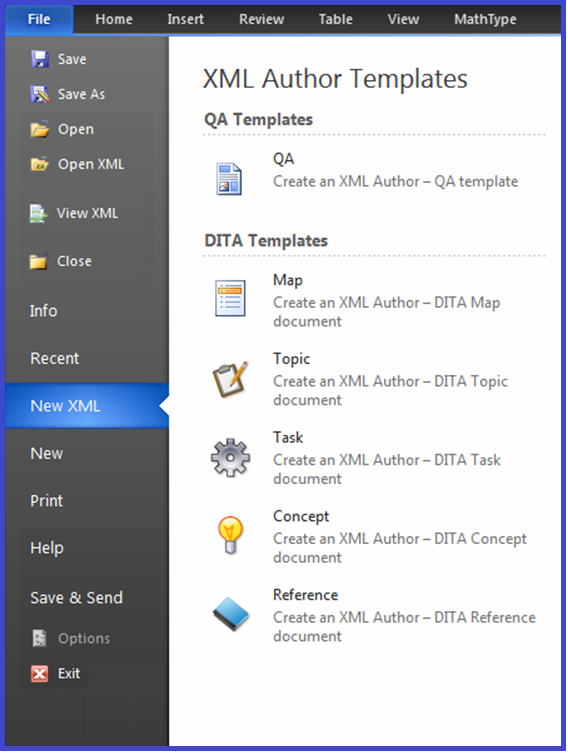
Figure 4-4: File > XML Author submenu
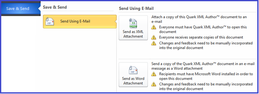
Figure 4-5: File > Save & Send submenu
Hiding menu items in Word 2010 and later
Hiding Items in the Backstage View
This section describes how to hide standard Word menu items in the Backstage view. This is typically done to hide Word features that do not apply to an XML authoring session or that might corrupt or damage an XML Author document.
For controls on the Backstage view, XML Author only supports the following:
-
visible in all Word and XML Author documents
-
not visible in all Word and XML Author documents
For more information on specifying visibility, see “
This is accomplished using a template stub.
In the following example template stub, the TabInfo and TabShare items are hidden by setting the visible attribute to false.
<?xml version="1.0" encoding="utf-8"?>
<customUI xmlns="http://schemas.microsoft.com/office/2009/07/customui">
       <backstage>
              <tab idMso="TabInfo" visible="false" />
              <tab idMso="TabShare" visible="false" />
       </backstage>
</customUI>
For Word 2010 or 2013, the template stub is named the following:
customUI14.xml
Given that a Word template is essentially a zip file. The following process adds a folder to template (zip) file and then adds the template stub to that new folder.
To incorporate a custom template stub:
-
Launch Windows Explorer.
-
Navigate to the folder where you installed Quark XML Author. This is typically the following folder:
C:\Program Files\Quark\XML Author\
-
Then, navigate to the subfolder that contains the Word Templates for the schema you are authoring in. For example, the template for the Quality Assurance configuration is located in the QA subfolder:
C:\Program Files\Quark\XML Author\QA\
-
Select the desired template. For example, the QA.dotx template file.
-
Rename the template file so that it has an extention of .ZIP.
-
Add a folder name “customUI” to this zip file.
-
Add your customUI14.xml file to the”customUI” folder.
-
Rename the template file back to its original filename by removing the .ZIP extention.
The specified items will be hidden from the Word 2010/2013 Backstage View the next time you open an XML Author document based on this template.
Programmatically closing the Backstage View
The following configuration example shows how to programmatically close the Backstage View. "Set the isDefinitive attribute true to close the Backstage view and return to the workbook when you click the Save & Close button."
<button id="DocumentAttributes" imageMso="FileProperties"      insertBeforeMso="ApplicationOptionsDialog" visible="XA" isDefinitive="true">
  <InternalClass name="DocumentAttributes"/>
</button>
Related information:
Adding Custom Commands and Changing the Visibility of Controls in the Office 2010 Backstage View
Quick Access Toolbar (QAT)
XML Author has the following limitations and considerations in regard to the QAT.The user can add any Word command to the QAT.
XML Author cannot hide commands on the QAT. See “Common Attributes”. XML Author can repurpose/override all commands on the QAT except Undo. See “Repurposing commands” and “Undo”. XML Author can disable any command on the QAT. See “Disabling commands”.
<ribbon>
The <ribbon> node, not to be confused with its ancestor, <Ribbon>, contains all of the information for the appearance of Word's Office menu and the ribbon.
Common Attributes
The <ribbon> node uses one attribute, defined in Table 4‑3.
Table 4‑3: <ribbon> Attributes
|
Attribute |
Value |
Description |
|
startFromScratch |
true|false |
Set to true if the entire built-in Word ribbon structure is to be discarded. Set to false if the existing ribbon is to be modified rather than built from scratch. Defaults to false.
Quark recommends setting this attribute to false. |
Child of
The <ribbon> is the child of <customUI>.
Parent of
The <ribbon> contain the following nodes:
-
<officeMenu>
-
<tabs>
-
<contextualTabs>
Example
The structure of the node is shown below.
<ribbon startFromScratch="false">
      <officeMenu/>
      <tabs/>
      <contextualTabs/>
</ribbon>
<separator>
The <separator> node specifies that a space will appear between two controls in the ribbon. This is typically used to create a space between two button groups.
Common Attributes
The <separator> node uses the following “Common Attributes”:
-
id (Required)
Child of
The <separator> node may be a child of the following nodes:
-
<group>
Parent of
The <separator> node may not contain any child nodes.
Example
In the example below, the highlighted node creates a space between the box and menu.
<box id="WindowButtonBox" boxStyle="vertical">
      <!-- Control details ommitted -->
</box>
<separator id="GroupWindowSeparator2"/>
<menu idMso="WindowSwitchWindowsMenuWord" size="large">
      <!-- Control details ommitted -->
</menu>
<splitButton>
The <splitButton> node defines a Split Button. A split button can be clicked like a regular button, but also makes available to the user a menu of one or more additional commands if the drop-down arrow is clicked. A child <button> node indicates the button-click behavior. A child <menu> node contains the additional commands that may be performed.
To use a native Word split button, specify a value for the idMso attribute.
To define a custom split button, specify a value for the id attribute.
Common Attributes
The <splitButton> node uses the following “Common Attributes”:
-
id or idMso (Required)
-
size
-
visible
Child of
The <splitButton> node may be a child of the following nodes:
-
<box>
-
<buttonBox>
-
<group>
-
<officeMenu>
Parent of
The <splitButton> node may contain the following nodes:
-
<button>
-
<menu>
-
<toggleButton>
Example
In the example below, the split button acts as a Selection button when clicked, but the user can also access a menu with a different option.
<splitButton id="SelectXA">
      <button id="SelectButtonXA" imageMso="SelectMenu"/>
      <menu id="SelectMenuXA">
            <button idMso="SelectAll"/>
      </menu>
</splitButton>
<tab>
Each <tab> node contains one or more <group> nodes, which in turn contain the array of control definitions that are presented on the ribbon tab.
Common Attributes
The <tab> node uses the following “Common Attributes”:
-
id or idMso (required)
-
visible (required)
The following common attributes for the <tab> node may still be used but have been deprecated:
-
keytip
-
label
To define these values, use the Resources file.
Child of
The <tab> node may be a child of the following nodes:
-
<tabs>
Parent of
The <tab> node may contain the following nodes:
-
<group>
Example
A native Word tab is defined by identifying it with the idMso attribute. The visible attribute must be set to Word so that it will not be shown when a Quark XML Author document is active. The example below is for the native Word Home tab.
<tab idMso="TabHome" visible="Word"/>
Native Word tabs may have child items in order to disable or enable specific items while a Quark XML Author document is the active document. In the example below, the Word Print Preview tab has been redefined so that the second group only displays when a Quark XML Author document is not active.
<tab idMso="TabPrintPreview" visible="true">
      <group idMso="GroupPrintPreviewPrint" visible="true"/>
      <group idMso="GroupPrintPreviewPageSetup" visible="Word"/>
      <group idMso="GroupZoom" visible="true"/>
      <group idMso="GroupPrintPreviewPreview" visible="true"/>
</tab>
Tabs specific to Quark XML Author use the id attribute. The visible attribute must be set to XA so that they will only be shown when a Quark XML Author document is active. The example below shows the structure of a Quark XML Author tab.
<tab id="TabXAHome" visible="XA">
      <group id="CopyPasteXA">
            <!-- Control definitions ommitted -->
      </group>
      <!-- Additional groups ommitted -->
</tab>
Appearance order for the tabs matches the definition order.
<tabs>
The <tabs> node contains definitions for all of the ribbon tabs available in the application.
Common Attributes
The <tabs> node uses no attributes:
Child of
The <tabs> node may be a child of the following nodes:
-
<ribbon>
Parent of
The <tabs> node may contain the following nodes:
-
<tab>
Example
Each ribbon tab is represented by a <tab> node within <tabs>. An example is shown below.
<tabs>
      <tab id="TabXAHome" visible="XA">
            <!-- Control definitions ommitted -->
      </tab>
      <tab id="TabXAInsert" visible="XA">
            <!-- Control definitions ommitted -->
      </tab>
      <tab id="TabXAReview" visible="XA">
            <!-- Control definitions ommitted -->
      </tab>
      <tab id="TabXATable" visible="XA">
            <!-- Control definitions ommitted -->
      </tab>
      <tab id="TabXAView" visible="XA">
            <!-- Control definitions ommitted -->
      </tab>
      <tab idMso="TabHome" visible="Word"/>
      <tab idMso="TabInsert" visible="Word"/>
      <tab idMso="TabPageLayoutWord" visible="Word"/>
      <tab idMso="TabReferences" visible="Word"/>
      <tab idMso="TabMailings" visible="Word"/>
      <tab idMso="TabReviewWord" visible="Word"/>
      <tab idMso="TabView" visible="Word"/>
      <tab idMso="TabDeveloper" visible="Word"/>
      <tab idMso="TabAddIns" visible="Word"/>
      <tab idMso="TabPrintPreview">
            <!-- Control definitions ommitted -->
      </tab>
      <tab idMso="TabBlogInsert" visible="Word"/>
      <tab idMso="TabBlogPost" visible="Word"/>
</tabs>
<toggleButton>
The <toggleButton> node defines a toggle button.
To use a native Word toggle button, specify a value for the idMso attribute.
To define a custom toggle button, specify a value for the id attribute.
Common Attributes
The <toggleButton> node uses the following “Common Attributes”:
-
id or idMso (Required)
-
image or imageMso
-
showLabel
-
size
The following common attributes for the <toggleButton> node may still be used but have been deprecated:
-
keytip
-
label
-
description
-
screentip
To define these values, use the Resources file.
Unique Attributes
The <toggleButton> node uses one required attribute, defined in Table 4‑4.
Table 4‑4: <toggleButton> Attributes
|
Attribute |
Value |
Description |
|
getPressed |
GetPressed |
Defaults to no value. When set, allows internal classes to set the Pressed state of a ribbon button. Currently used by the following internal event handlers: ChangeToList, ChangeToPara, InlineAttributes, and ToggleCommentsPane. This is always set programmatically and is not specified by a configuration engineer. |
Child of
The <toggleButton> node may be a child of the following nodes:
-
<box>
-
<buttonGroup>
-
<group>
-
<menu>
-
<splitButton>
Parent of
The <toggleButton> node may contain the following nodes:
-
<InternalClass>
-
<ExtensibilityMethod>
-
<ShortcutKey>
These nodes define the behavior of the control.
Example
A sample toggleButton is shown below.
<toggleButton id="HideEmpties" imageMso="LineSpacing" showLabel="false">
<!-- Control details ommitted -->
</toggleButton>
Common Attributes
Table 4‑5: Common Attributes
|
Attribute |
Value |
Description |
|
description |
String displaying the control description. |
Deprecated. Specify the control description in “Resource Files”. |
|
id |
String to identify the control. |
Must be unique within the configuration. See "Unique Ids". |
|
idMso |
Name of a native Word control. |
Word control names can be found in WordRibbonControls.xslx. |
|
image |
Name of the image to display as an icon for the control. |
Icons are internal to Quark XML Author (Xpress.dll). |
|
imageMso |
Name of a native Word control; the icon from the control is used for the Quark XML Author control. |
Word control names can be found in WordRibbonControls.xslx. |
|
insertAfterMso |
Name of a native Word control. |
The control will be placed after the named Word control in the menu or group. |
|
insertBeforeMso |
Name of a native Word control. |
The control will be placed before the named Word control in the menu or group. |
|
label |
String to be displayed as the control's label. |
Deprecated. Specify the control label in the Resources file. |
|
keytip |
1-3 alphanumeric characters to be displayed as the control's keytip. |
Deprecated. Specify the control screen tip in the Resources file. |
|
screentip |
String to be displayed as the control's screen tip. |
Deprecated. Specify the control's screen tip in the Resources file. |
|
showLabel |
false |
Defaults to true. If set to false, hides the control's label. |
|
size |
large |
Display size of the button, split button, or toggle button. Defaults to small. |
|
sizeString |
One or more X characters |
Specifies the size of the drop-down control. For example, a value of XXXX indicates a width of four characters. |
|
title |
String to be displayed as the control's title. |
Deprecated. Specify the control's title in the Resources file. |
|
visible |
false|true|Word|xa |
Determines when the control is available. Settings may be combined using the pipe character. false: control is not visible in all Word and XML Author documents. true: control is visible in all Word and XML Author documents. Word: control is only visible in Word documents. xa: control is only visible in XML Author documents. OLEWordDocument: control is only visible in embedded Word documents. |
Unique Ids
The Ribbon configuration does not support duplicate IDs, therefore a feature that is present more than once in the ribbon must have a unique ID for each occurrence of that feature.
For example, in the DITA configuration, the Properties button exists on the Home and View ribbon. Both occurrences of the button call the same Extensibility Method "DocumentProperties".
<button id="DocumentPropertiesXA" label="Properties" keytip="PR" imageMso="FileProperties">
       <ExtensibilityMethod id="DocumentProperties" />
</button>

<button id="ViewDocumentPropertiesXA" imageMso="FileProperties" label="Properties" keytip="DP">
       <ExtensibilityMethod id="DocumentProperties" />
</button>
Undo
The user must not be allowed to invoke the Undo feature in Microsoft Word because:
Standard options/techniques for preventing a user from invoking a Word command include hiding it, disabling it, and repurposing or overriding it. However, Undo is a unique and special case which must be handled differently than other Word commands.
On the QAT, the only Word command that cannot be repurposed/overridden is Undo.
QAT is the only UI in which we are unable to hide Word commands. Now we can disable a Word idMso command across all user interfaces in Word including: Ribbon, Toolbar, Menus, and Quick Access Toolbar.
Printing
Several of the Word page setup features are not XML aware and therefore should be excluded from the user interface. If that is not possible, then the user must be warned not to use those features.
Word 2010 and later
In the Backstage View for Print, the Quark XML Author Page Setup feature is provided. This feature is used to specify page orientation and layout settings specific to XML Author documents. In that view, Word’s Orientation button and Page Setup link are not XML aware and therefore should not be used. The user is provided that warning
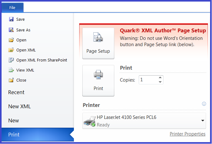
Figure 4‑6: Backstage View for Print
Hiding/Disabling Ribbon Tabs for Third-Party Software
The Quark XML Author add-in cannot influence the position or visibility of the ribbon tabs of a third-party add-in. Therefore, disabling the add-in is the only way to remove its ribbon tab when Quark XML Author is in focus/active.
This is accomplished using DisableTemplateAddins. See “DisableTemplateAddins”.