
HTML5 Publications
Exporting as HTML5 Publication
To export a layout as HTML5 Publication:
-
Choose File > Export as > HTML5 Publication. The Export as HTML5 Publication dialog displays.
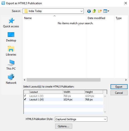
Export as HTML5 Publication dialog -
Navigate to the folder you want to save the HTML5 Publication to.
-
Select the layout(s) you want to use to create the multi-device HTML5 publication.
-
Choose a predefined output style from the HTML5 Publication Style drop-down menu or click Options to define the export settings for the selected layout(s). If you click Options, the HTML5 Publication Export Options dialog displays.
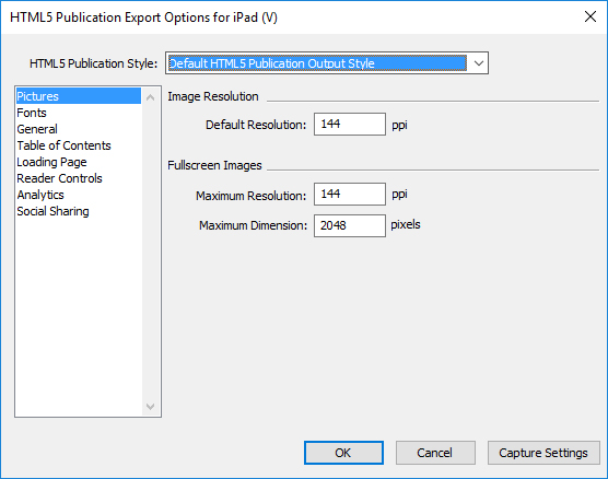
HTML5 Publication Export Options dialog Output styles can be managed by selecting Edit > Output Styles. See "A Guide to QuarkXPress".-
Configure the output style using the following panes in the HTML5 Publication Export Options dialog.
-
Use the Pictures pane to specify the resolution of pictures in the HTML5 Publication file.
-
Use the Fonts pane to enable/disable packaging referenced fonts. If disabled, the fonts will NOT be collected and the output may not be WYSIWYG. If enabled, users will get an alert about font licensing.
-
Use the General pane to enable/disable converting QuarkXPress Layout Sections to Page Stacks in the App and to set the lock orientation. Enable/disable "Continuous Page Stacks" to create a single continuous page of all pages in a section.
-
Use the Table of Contents pane to select a named section from the list and all the pages in that section will be exported as TOC Pages. You may also choose to include pages in publication, otherwise these pages will not be added to content pages. Specify a title for the TOC to be used in the TOC Banner.
-
Use the Loading Page pane to specify the appearance and behaviors of the loading page in a web reader.
-
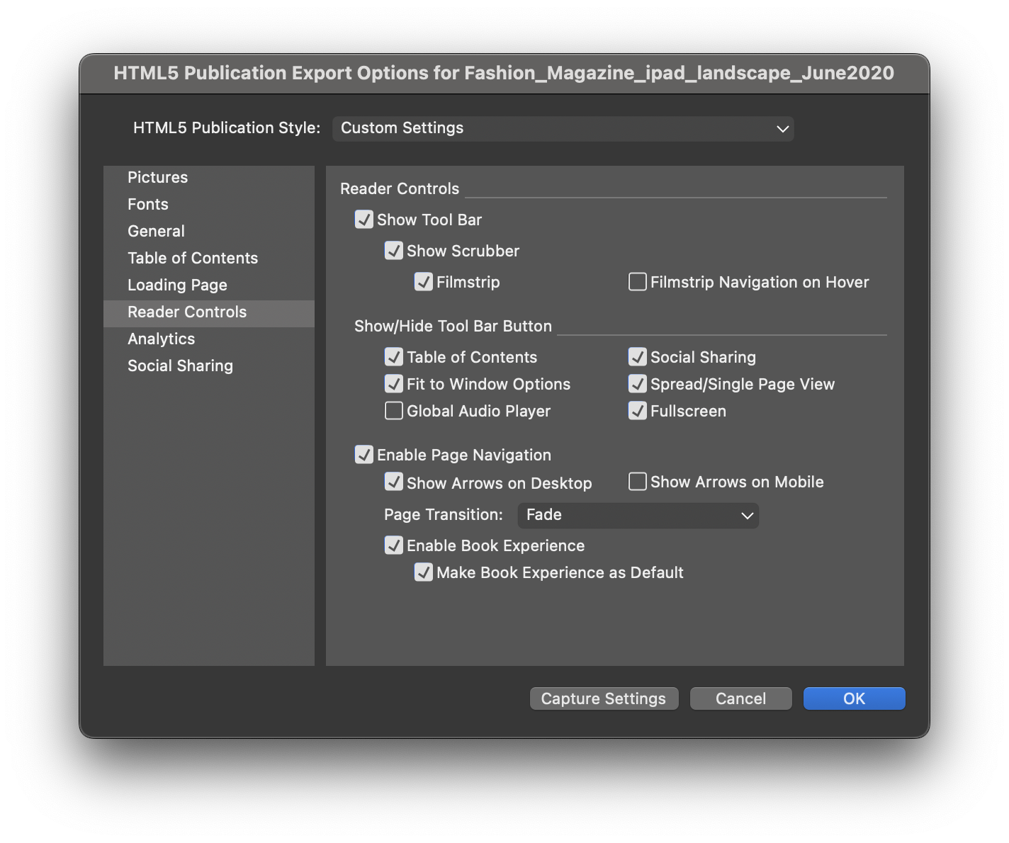
Use the Reader Controls pane to specify the appearance and behaviors of the layout in a web reader.
-
Use the Analytics pane to enable/disable Google analytics and define a Google maps API key for geolocation.
-
Use the Social Sharing pane to define the settings for social medium platforms.
-
-
-
When you're finished configuring options, click OK. To capture the current settings without creating an HTML5 Publication file, click Capture Settings.
-
Click Export.
Reader Controls
The "Book Experience" feature has been introduced for HTML5 Publications. Users can enable the "Enable Book Experience" option in "Reader Controls" when exporting HTML5 Publications to achieve a realistic book flipping experience when viewing their publication in web browsers.
The "Enable Book Experience" selection is enabled by default to activate the book icon. However, in case user wants to experience the page flip view by default, the "Make Book Experience as Default" needs to be selected.
Web app configuration
Configure your web app using the "reader-config.json", the "ui-config.css" and the "manifest.json" files located at the root of your output.
Use these file to configure the following:
-
Look and feel
-
Features
-
Analytics
-
Social sharing
reader-config.json
General app configuration
Use the app section to configure some general application attributes:
-
To specify the settings for the loading screen (the loading image, the font color and the background color), define these in the
<loading>section, using thecolor,backgroundColor, andimageparameters. -
You can choose the orientation of display pages in the respective devices using the
mobileanddesktopparameters in the<orientation>section.Valid values for
orientation > mobileandorientation > desktopareboth,portrait, andlandscape. For example, to display only landscape pages on desktop, lock the orientation of desktop tolandscape. The default value is "both".
"app": {
   "title": "Quark App Studio Web App",
   "summary": "Pub description/summary goes here",
   "urlRoot": "./",
   "configFilename": "application-config.webreader.json",
  "orientation": {
         "mobile": "both",
         "desktop": "both"    },
    "privacy": {
         "enableCookieBanner": false,
         "cookieBannerMessage": "",
         "cookieAcceptButtonText": "",
          "cookieSource" : "",
          "cookieUrlButtonText" : ""    },
    "loading": {
          "image": "images/loading-logo.png",
          "backgroundColor": "#fff",
           "color": "#333333"    },
    "params": {
          "loglevel": -1    },
     "enableCookies": true,
    "enableExternal": true,
    "mobileOnly": false  },
"googlemaps": {
"key": "" },-
Use the
keyparameter under thegooglemapssection to enter a Google Maps browser API key to use Google Maps (geolocation widget) in your webapp as keyless access to Maps is restricted by Google, (auto > googlemaps > keyin the extensions). For more details see, "http://developers.google.com/maps/documentation/javascript/get-api-key".
Features configuration
Use the features section to enable/disable features in your Web App, and configure these features for
your app.
toc is "false", the TOC button will not be visible even if you have configured it in
the toolbar section. "features" : {
"toc" : true,
"banner" : true,
"toolbar" : true,
"pageFit" : true,
"sharing" : true,
"scrubber" : false,
"analytics" : false,
"fullScreen" : true
"SpreadView" : true,
"smartBanner" : true,
"authorization" : true,
"pageNavigation" : true,
"variantSwitching" : true,
"globalAudioPlayer" : true,
"storeAccessibility" : true,
}-
Use the
toolbarparameter to show/hide the toolbar in the webapp. If the toolbar display istrue, the other toolbar button customizations will come into play."toolbar": { "visibility": "auto" | "initially" | "always", "items": [ "storeButton", "tocButton", "scrubberBar", "pageFitButton", "spreadViewButton", "sharingButton", "globalAudioButton", "fullScreenButton" ] },-
Use the
visibilityparameter to configure visibility of the toolbar. The allowed values for the visibility parameter are: auto, initially, and always. -
Use the items parameter to change the order of position of the buttons on the toolbar. The item will appear in the order they are listed in the array.
-
-
Use the
tocparameter to show/hide the TOC button in the toolbar. Turn it on if the publication uses section pages as table of contents. Further customize it using thetocsection.-
Display the TOC title as a banner using the
bannerparameter. -
Visibility of the toc can be customised to show the toc when the web app is loaded using the
showInitiallyparameter."toc": { "banner": true, "showInitially": false, "tocNonHtml": { "titleLines": 4, "showImage": false, "showHTMLTitle": false, "showDescription": false, "descriptionLines": 2 } },
-
-
Use the
scrubberparameter to show/hide the scrubber in the toolbar.-
When the scrubber bar is enabled, use the
filmStripparameter under thescrubbersection, to show/hide the filmstrip display on the page thumbnails in the issue. -
Visibility of the filmstrip can be customised to show the filmstrip when the web app is loaded using the
showInitiallyparameter under thefilmstripsection. -
Further enable/disable thumbnail navigation on the desktop using a mouse hover using the
mouseHoverNavigationparameter under thefilmstripsection."scrubber": { "filmStrip" : true }, "filmStrip": { "showInitially" : true, "mouseHoverNavigation" : false },
-
-
Use the
sharingparameter to show/hide the Sharing button in the toolbar. -
Use the
globalAudioPlayerparameter to show/hide button to view the player for global audio. -
Use the
pageNavigationparameter to stop the user from navigating to other pages, except via interactivities, the toc, or the scrubber bar. WhenpageNavigationis enabled, the user can configure the display of navigation arrows as mentioned in Navigation configuration. -
Use the
fullScreenparameter to show/hide the button to enter fullscreen mode on the desktop. -
Use the
pageFitto show/hide the button that can toggle between the page fitting options (ie Fit Page to Window (autofit mode) and Fit Width). -
Use the
spreadViewto show/hide the toggle button which can help switch between Single Page display or Facing Pages display for a publication with facing pages.If the publication has only single pages, then this button is not available by default (irrespective of the setting).
Social sharing configuration
Use the socialSharing and features sections to enable and configure the social media sharing options for your app.
-
Use the
sharingparameter of thefeaturessection to enable/disable the social sharing button from the toolbar. -
Use the
socialSharingsection to configure the social media sharing options for your app. -
Use the parameters of the
optionssection (i.e.twitterShare,facebookShare,emailShare,linkedinShare) to enable/disable the available sharing options.For Facebook sharing, you can generate your own Facebook AppID and update it in theAppIDproperty. For more information see "http://developers.facebook.com/docs/apps/register".
"features" : {
  ...
  "sharing" : true
  ...
}
"socialSharing": {
  "facebook": {
    "AppID": "125714554250404",
    "caption": "locale:facebook-sharing",
    "description": ""
  },
  "options": {
    "facebookShare" : true,
    "twitterShare" : true,
    "emailShare" : true,
    "linkedinShare" : true
  }
}caption and description parameters for Facebook, under the Sharing section have been deprecated. (https://developers.facebook.com/docs/sharing/reference/feed-dialog)Most content is shared to Facebook as a URL, so it's important to mark up your website with Open Graph tags to take control over how content appears on Facebook. For more information see "https://developers.facebook.com/docs/sharing/webmasters".
Configure the title of the post, images, and descriptions that are to be shown in a Facebook post through "index.html". By default this configuration is commented out, you can uncomment these lines and add content as per your requirements.
<meta property="og:title" content=""/>
<meta property="og:description" content=""/>
<meta property="og:image" content=""/>-
title: The title of your article without any branding such as your site name. Type the title in the ‘content’ field.
-
description: A brief description of the content, usually between 2 and 4 sentences. This will be displayed below the title of the post on Facebook. Type the description in the ‘content’ field.
-
image: The URL of the image that appears when someone shares the content to Facebook. Type the URL of the image in the ‘content’ field. Use images that are at least 1200 x 630 pixels for the best display on high resolution devices.
At a minimum, you should use images that are 600 x 315 pixels to display link page posts with larger images. Images can be up to 8MB in size. See the following link for best practices: //developers.facebook.com/docs/sharing/best-practices#images
Analytics configuration
Use the analytics section to configure Google analytics tracking for your app.
-
To specify a Google tracking ID for your app, use the trackingId parameter of the <GoogleAnalytics> section, to update with your own trackingID.
For more information see "http://www.google.com/analytics/".
"analytics": {
  "GoogleAnalytics": {
    "trackingID": "UA-20677225-13",
    "enhancedLinkAttribution": false
    "anonymizeIp": false
  },
},
Navigation configuration
Use the pageNavigation section to configure the page navigation for your app.
-
Use the
showArrowsForMobileparameter to enable/disable the display of page navigation arrows on the mobile version of your webapp. The user can navigate pages using the arrows in addition to navigation using the scrubber bar, filmstrip, toc or interactivity. -
Use the
showArrowsForDesktopparameter to enable/disable the display of page navigation arrows on the desktop version of your webapp. The user can navigate pages using the arrows in addition to navigation using the scrubber bar, filmstrip, toc or interactivity. -
Use the
transitionparameter to define page transtion effects (Fade, Slide and None).
"pageNavigation": {
  "showArrowsForMobile": false,
  "showArrowsForDesktop": true,
  "transition": slide
},
View configuration
Use the pageFitView and the spreadView sections to configure the view for your app.
pageFitView
-
Use the
defaultModeparameter to set the default fitting mode of the publication page in your webapp. Pages can be scaled up or down appropriately to fit the device size / browser size. Publication pages viewed in a webapp can be displayed as:-
autofit- the pages will be scaled proportionally in both dimensions to display the complete page to fit in the device browser. -
widthfit- size the pages to fill the device browser width and enable scrolling.
-
-
Use the
maxScaleForAutoFitparameter to specify the max limit for scaling a page in autofit mode. To limit scaling beyond 100% of the original dimensions, specify a value of 1. For 200% specify a value of 2. To have no limit restriction and to be able to scale pages as much as the browser size specify a value of 0.
"pageFitView": {
  "defaultMode": "autofit",
  "maxScaleForAutoFit": 4
},
spreadView
if facing pages (portrait or landscape) are available in the publication they will be displayed in landscape orientation in a device, or landscape like dimensions in the desktop browser. By default, the facing pages display is on, and a user can toggle the display to single page and vice versa.
-
Use the
mobileparameter under theshowLandscapeFacingparameter to enable/disable the display of landscape facing pages on the device.
"spreadView": {
  "showLandscapeFacing": {
  "mobile": false,
  "desktop": true
  }
}
Privacy settings configuration
Use the app section to configure the privacy settings for your app:
"app": {
          …
          "privacy": {
          "enableCookieBanner": false,
          "cookieBannerMessage": "",
          "cookieAcceptButtonText": "",
          "cookieSource" : "",
          "cookieUrlButtonText" : ""
          },
},-
enableCookieBanner: When true, presents the cookie disclaimer at the bottom of the page. By default, the value is set as false. -
cookieBannerMessage: Text to be displayed in the cookie disclaimer. HTML tags can also be included in this text to create a hyperlink to the privacy policy page. (For example: "This website uses cookies to improve your experience on our website. By continuing to browse this site, you are agreeing to our use of cookies. You can disable cookies in your browser settings at any time. More information in our Privacy policy.".) -
cookieAcceptButtonText: The label of the button which dismisses the cookie disclaimer banner. (For Example: "I Understand".) -
cookieSource: Path of the HTML (relative /URL) containing the Cookie Policy/Privacy Policy. -
cookieUrlButtonText: The label of the button to open the HTML page given incookieSource. (For example: "Learn More".)
ui-config.css
:root {
--app-background: #333;
--toolbarItem-background-color: #000;
--toolbarItem-background-color-on-hover: #00aeef;
--toolbar-svg-color: #a3a3a3;
--toolbar-svg-hover-color: #fff;
--scrubber-thumb-color: #a3a3a3;
--scrubber-thumb-hover-color: #fff;
--timeline-background-color: rgba(66, 65, 66, 0.88);
--timeline-thumbnail-border-color: #00aeef;
--toc-banner-color: #000;
}-
Use the
app-backgroundparameter to set the background color of the application. -
Use the
toolbarItem-background-colorparameter to set the background color of toolbar item. -
Use the
toolbarItem-background-color-on-hoverparameter to set the background color of the toolbar item on hover. -
Use the
toolbar-svg-colorparameter to set the svg color of the toolbar item. -
Use the
toolbar-svg-hover-colorparameter to set the svg color of the toolbar item on hover. -
Use the
scrubber-thumb-colorparameter to set the color of the dragging handle of the scrubber bar. -
Use the
scrubber-thumb-hover-colorparameter to set the color of the dragging handle of the scrubber bar on hover. -
Use the
timeline-background-colorparameter to set the background color of the filmstrip which shows thumbnails. -
Use the
timeline-thumbnail-border-colorparameter to set the border color of thumbnail of the current page in the filmstrip. -
Use the
toc-banner-colorparameter to set the background color of the toc banner.
manifest.json
{
  "name": "App Studio",
  "short_name": "App Studio",
  "start_url": "index.html",
  "display": "standalone",
  "theme_color": "#3f51b5",
  "background_color": "#000",
  "icons": [{
      "src": "images/manifest/apple-touch-icon.png",
      "type": "image/png"
    },
    {
      "src": "images/manifest/apple-touch-icon-76x76.png",
      "type": "image/png",
      "sizes": "76x76"
},…-
Use the
nameparameter to set the app name that appears on the home and splash screens. -
Use the
displayparameter to set the display behavior of the home screen. It has two values:-
standalone: The home screen shortcut will open the app in full screen mode.
-
browser: The home screen shortcut will open the app in a browser in a new tab.
-
-
Use the
theme_colorparameter to set the color of the status bar. The meta tag for theme_color is defined in the "index.html" file which overrides the theme_color defined in the manifest file. -
Use the
background_colorparameter to set the background color of the splash screen of the home screen app. -
Use the
iconsparameter to define the home screen app icons. Specify the icons of different sizes for different device sizes.
Cookie consent and privacy policy configuration
Your privacy policy should disclose the fact that your web app uses cookies, and supply them with a list of cookies that are used/stored.
We recommend that your privacy policy include something similar to the following:
What are cookies and how do they work?
Cookies are pieces of information stored on your hard drive containing information about you. These pieces of information allow the Service to remember important information that will make your use of the Service more useful. Web App uses cookies for a variety of purposes. For instance, we use cookies to allow your automated login and to track your preferences. You can choose to turn off the cookies through your browser settings. If you turn off the cookies, you may still use the Service, but we will not be able to save your preferences.
What cookies does the Web App use?
The following is a list of the technical that are used/stored in the Web App:
|
Cookie Name |
Cookie Purpose |
|
ASconsent |
Used to set the state of cookie consent banner, if user accepted once then next time banner will not be displayed. |
For more information please see our entire privacy policy here....
Web app capabilities
Autofit and Autoscale HTML5 Publication
Regardless of the layout size, users will be able to view the output on any device without truncation. The layout will be auto fit according to device size or desktop browser size, and scaled proportionally to completely fit to the device screen size. For example, content created for iPad can also be viewed on smaller devices like iPhones and vice versa.
Users can additionally switch to Fit to Window width and enable scrolling.
Zoom in/out page on mobile devices
Users will be able to zoom in/zoom out content on devices via pinch in and pinch out gestures. Users will also be able to perform content panning in zoom mode on mobile devices for an enhanced reading experience. When in zoom mode, page swipe will be restricted and panning action will take precedence. Users can perform reset zoom using a double tap.
Web app performance
Web app performance can be increased if the content uploaded on the server is compressed. Another way to improve performance is to utilize file compression.
For example, for the apache server, the ".htaccess" file in the root folder compresses the files and therefore enhances the performance. Users can contact the hosting service for this feature.
Web app available for offline reading
The Web app will be available for offline reading once viewed. All text content in the issues will be available. Images and other assets on the current and next/previous page will also be available. Web app will be available in offline mode on browsers which support 'Service worker' as offline support is based on the cached mechanism available through service worker.
Hosting an HTML5 package on a web server
To view your HTML5 publications in a web browser, (mobile devices, Windows or Mac) deploy a web server where you can host the exported package, exactly like you would host any website.
To deploy a web app:
-
Setup the web server.
-
Host the HTML5 publication package.
-
View the output.
To customize the look and feel, branding, and features that will be available in the hosted web app, see "HTML5 Publication output styles."
An example for deploying on macOS
Enable Apache web sharing on Mac OS X
-
Open the terminal, found at
/Applications/Utilities/Terminal. -
Run the command "sudo apachectl start".
-
Supply the root password.
Test to see if the web server is running
-
Open the browser and navigate to http://localhost.
-
You should see "It Works!".
Web share the digital output
-
Create a folder (i.e. 'Digital') and copy the digital output folder to
/Library/WebServer/Documents/Digital. -
Open the folder properties and unlock security.
-
Give Read & Write permissions to required users and Read only permissions to everyone, and apply to enclosed items.
View the digital output
-
Open browser and navigate to http://localhost/Digital.
-
You will be redirected to the first page in the issue.